Docs / Bottom bars / 18
SatelliteBottomBar
Flat bar where an accent orb glides to the selected icon while a small satellite dot circles it once on the way.
Preview
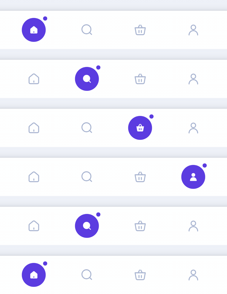
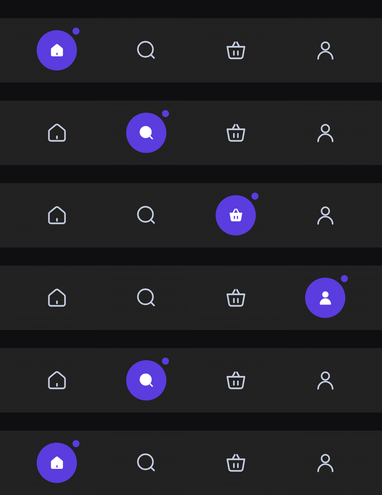
A flat bar of icon-only tabs. The selected icon fills in inside an accent orb with a small satellite dot parked off its top-end side. On a new selection the orb glides to the new tab while the satellite circles it once.
Usage
SatelliteBarItem has no center item: any tab can be selected, and every slot gets the same width. The bar only shows icons; the selected one switches to its selectedIcon inside the orb. label is read out by TalkBack.
import com.nameisjayant.bottombar.satellite.SatelliteBarItem
import com.nameisjayant.bottombar.satellite.SatelliteBottomBar
import com.nameisjayant.bottombar.satellite.SatelliteBottomBarDefaultsval items = listOf(
SatelliteBarItem("Home", Icons.Outlined.Home, Icons.Filled.Home),
SatelliteBarItem("Wallet", Icons.Outlined.AccountBalanceWallet, Icons.Filled.AccountBalanceWallet),
SatelliteBarItem("Stats", Icons.Outlined.PieChart, Icons.Filled.PieChart),
SatelliteBarItem("Profile", Icons.Outlined.Person, Icons.Filled.Person),
)
SatelliteBottomBar(
items = items,
selectedIndex = selectedIndex,
onItemClick = { selectedIndex = it },
)Sizing and behavior
The bar is BarHeight (64dp) tall and spans the full width. The orb is OrbSize (40dp) across, and the SatelliteSize (7dp) dot rests SatelliteGap (7dp) off its edge, 45° up on the end side. Unselected icons are IconSize (24dp); the selected one is SelectedIconSize (18dp). When the selection changes, the orb glides to the new tab on a spring and the satellite makes one full turn around it in the direction of travel, landing back at its rest spot. Icons fade from outlined to filled as the orb passes over them (mirrored in right-to-left layouts). The outline is a plain rectangle, so shadowElevation works on every API level.
Colors
Colors come from SatelliteBottomBarDefaults.colors(darkTheme), lightColors(...) and darkColors(...). Start from either palette and override only what you need.
| Color | Used for |
|---|---|
containerColor | The bar |
indicatorColor | The orb behind the selected tab |
satelliteColor | The satellite dot (defaults to indicatorColor) |
selectedContentColor | Icon inside the orb (white by default) |
unselectedContentColor | Icons of the other tabs |
SatelliteBottomBar(
    items = items,
    selectedIndex = selectedIndex,
    onItemClick = { selectedIndex = it },
    // Follow your app's theme instead of the system one.
    colors = SatelliteBottomBarDefaults.colors(darkTheme = isDarkTheme),
)
API
The full signature of the composable and its item class:
fun SatelliteBottomBar(
    items: List<SatelliteBarItem>,
    selectedIndex: Int,
    onItemClick: (index: Int) -> Unit,
    modifier: Modifier = Modifier,
    colors: SatelliteBottomBarColors = SatelliteBottomBarDefaults.colors(),
    shadowElevation: Dp = 0.dp,
    windowInsets: WindowInsets = SatelliteBottomBarDefaults.windowInsets,
)

class SatelliteBarItem(
    val label: String,
    val icon: ImageVector,
    val selectedIcon: ImageVector = icon,
)