Docs / Bottom bars / 20
CollarBottomBar
Bar with soft rounded corners and a ringed orb held in a collar; a comet sweeps around the ring when it is selected.
Preview
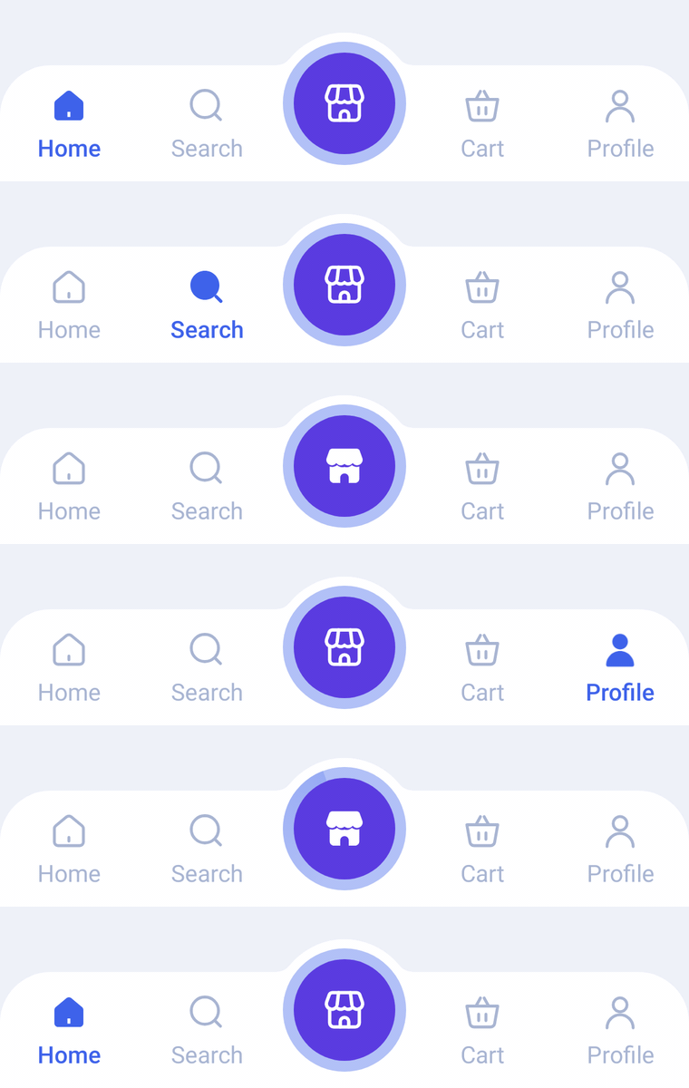
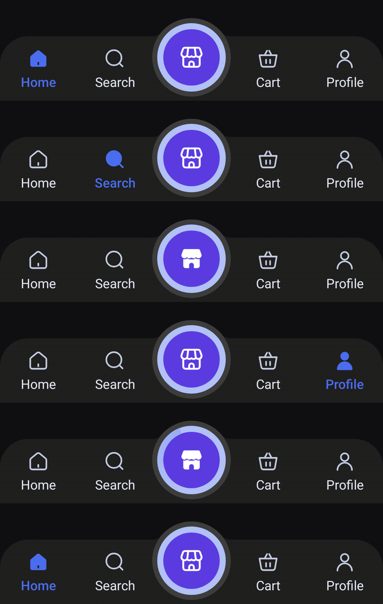
A flat bar with softly rounded top corners and a ringed center orb held in a collar that rises out of the top edge. Icons and labels always show; the selected tab fills in and turns the accent color, and a comet sweeps once around the orb's ring when it is selected.
Usage
CollarBarItem works like HaloBarItem: pass an odd number of items and the middle one becomes the orb. Side tabs always show their icon and label; the orb only uses label for TalkBack.
import com.nameisjayant.bottombar.collar.CollarBarItem
import com.nameisjayant.bottombar.collar.CollarBottomBar
import com.nameisjayant.bottombar.collar.CollarBottomBarDefaultsval items = listOf(
CollarBarItem("Home", Icons.Outlined.Home, Icons.Filled.Home),
CollarBarItem("Search", Icons.Outlined.Search, Icons.Filled.Search),
CollarBarItem("Store", Icons.Outlined.Storefront, Icons.Filled.Storefront),
CollarBarItem("Cart", Icons.Outlined.ShoppingBasket, Icons.Filled.ShoppingBasket),
CollarBarItem("Profile", Icons.Outlined.Person, Icons.Filled.Person),
)
CollarBottomBar(
items = items,
selectedIndex = selectedIndex,
onItemClick = { selectedIndex = it },
)Sizing and behavior
The bar body is BarHeight (64dp) tall with TopCornerRadius (28dp) top corners. The CollarSize (78dp) collar rises CollarRise (18dp) above the top edge and blends into it through CollarFilletRadius (10dp) curves. Inside it sits the OrbSize (68dp) orb with an OrbRingWidth (6dp) ring. The collar makes the outline concave, so shadowElevation only casts a shadow on API 30+.
Colors
Colors come from CollarBottomBarDefaults.colors(darkTheme), lightColors(...) and darkColors(...). Start from either palette and override only what you need.
| Color | Used for |
|---|---|
containerColor | The bar |
collarColor | The disk around the orb (the bar color in light, a lighter gray in dark) |
selectedContentColor | Icon and label of the selected side tab |
unselectedContentColor | Icons of the other side tabs |
unselectedLabelColor | Labels of the other side tabs |
orbColor | The center orb |
orbRingColor | The ring around the orb |
orbContentColor | The orb's icon |
cometColor | The comet that sweeps around the ring (defaults to selectedContentColor) |
CollarBottomBar(
    items = items,
    selectedIndex = selectedIndex,
    onItemClick = { selectedIndex = it },
    // Follow your app's theme instead of the system one.
    colors = CollarBottomBarDefaults.colors(darkTheme = isDarkTheme),
)
API
The full signature of the composable and its item class:
fun CollarBottomBar(
    items: List<CollarBarItem>,
    selectedIndex: Int,
    onItemClick: (index: Int) -> Unit,
    modifier: Modifier = Modifier,
    colors: CollarBottomBarColors = CollarBottomBarDefaults.colors(),
    labelStyle: TextStyle = CollarBottomBarDefaults.LabelStyle,
    shadowElevation: Dp = 0.dp,
    windowInsets: WindowInsets = CollarBottomBarDefaults.windowInsets,
)

class CollarBarItem(
    val label: String,
    val icon: ImageVector,
    val selectedIcon: ImageVector = icon,
)