Docs / Bottom bars / 02
DomeBottomBar
Rounded bar whose top swells into a dome around a glowing orb. Labels slide in under the selected tab.
Preview
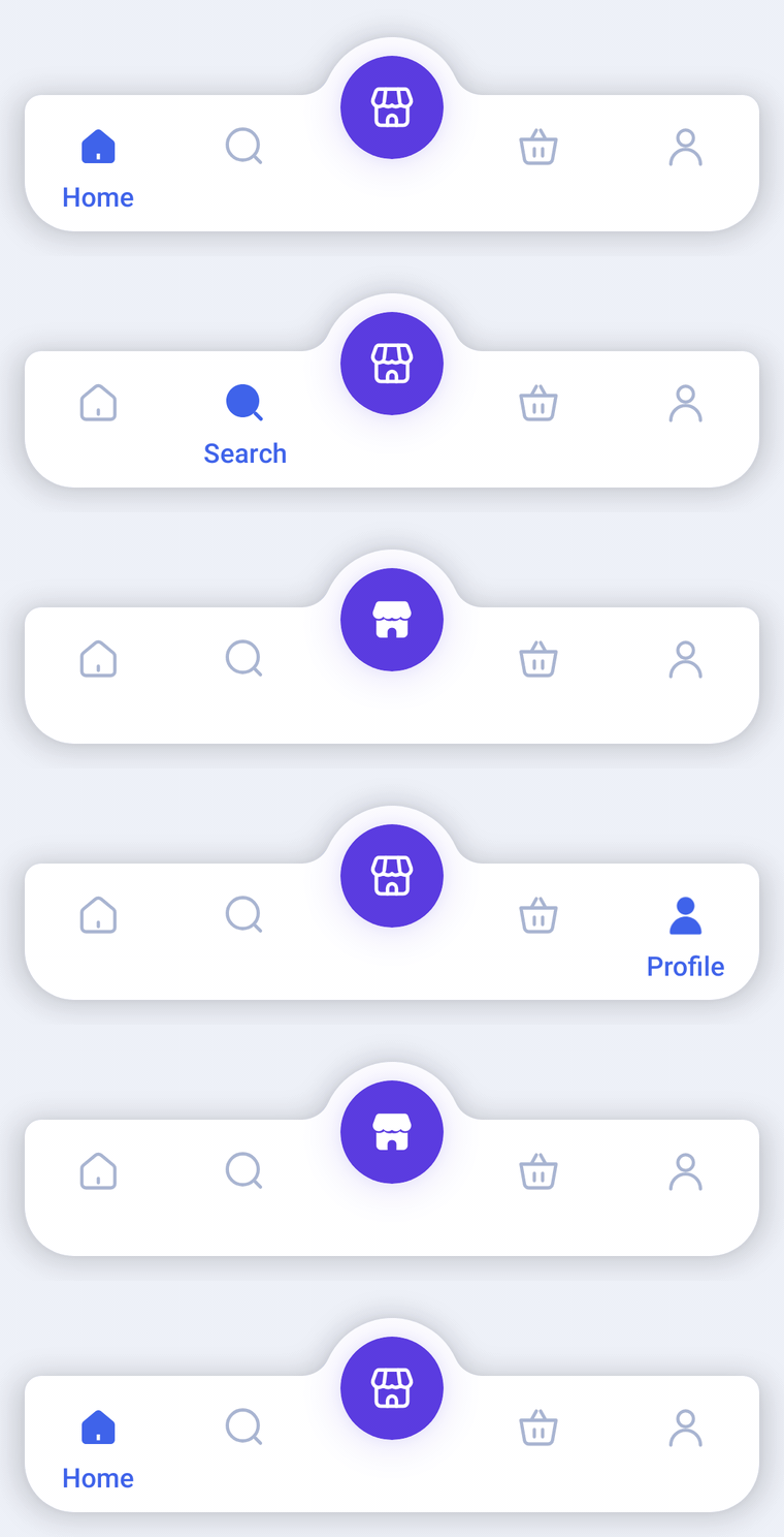
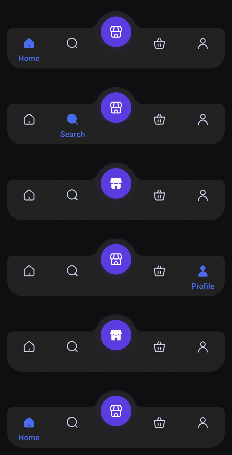
A floating, rounded bar whose top edge swells into a dome around a glowing orb. Icon-only tabs; the selected one fills in and its label slides up underneath.
Usage
DomeBarItem works like HaloBarItem, and the middle item becomes the orb inside the dome, so pass an odd number of items. Side tabs show only their icon; the selected one switches to its selectedIcon and its label slides in underneath.
import com.nameisjayant.bottombar.dome.DomeBarItem
import com.nameisjayant.bottombar.dome.DomeBottomBar
import com.nameisjayant.bottombar.dome.DomeBottomBarDefaultsval items = listOf(
DomeBarItem("Home", Icons.Outlined.Home, Icons.Filled.Home),
DomeBarItem("Search", Icons.Outlined.Search, Icons.Filled.Search),
DomeBarItem("Store", Icons.Outlined.Storefront, Icons.Filled.Storefront), // the orb
DomeBarItem("Cart", Icons.Outlined.ShoppingCart, Icons.Filled.ShoppingCart),
DomeBarItem("Profile", Icons.Outlined.Person, Icons.Filled.Person),
)
DomeBottomBar(
items = items,
selectedIndex = selectedIndex,
onItemClick = { selectedIndex = it },
// All four corners are rounded, so it looks best floating a little above the screen edge.
modifier = Modifier.padding(start = 12.dp, end = 12.dp, bottom = 12.dp),
shadowElevation = 8.dp,
)Sizing and behavior
The bar is BarHeight (66dp) tall plus DomeRise (28dp) for the dome, all inside its own bounds, so no extra room is needed above it. shadowElevation defaults to 0.dp; the dome makes the outline concave, which Android can only cast a shadow for on API 30+.
Colors follow the same pattern, through DomeBottomBarDefaults.colors(darkTheme), lightColors(...) and darkColors(...):
Colors
Colors come from DomeBottomBarDefaults.colors(darkTheme), lightColors(...) and darkColors(...). Start from either palette and override only what you need.
| Color | Used for |
|---|---|
containerColor | The bar and its dome |
selectedContentColor | Icon and label of the selected side tab |
unselectedContentColor | Icons of the other side tabs |
orbColor | Fill of the center orb |
orbGlowColor | Glow under the orb, and the pulse when it is selected |
orbContentColor | Icon inside the orb |
DomeBottomBar(
    items = items,
    selectedIndex = selectedIndex,
    onItemClick = { selectedIndex = it },
    // Follow your app's theme instead of the system one.
    colors = DomeBottomBarDefaults.colors(darkTheme = isDarkTheme),
)
API
The full signature of the composable and its item class:
fun DomeBottomBar(
    items: List<DomeBarItem>,
    selectedIndex: Int,
    onItemClick: (index: Int) -> Unit,
    modifier: Modifier = Modifier,
    colors: DomeBottomBarColors = DomeBottomBarDefaults.colors(),
    labelStyle: TextStyle = DomeBottomBarDefaults.LabelStyle,
    shadowElevation: Dp = 0.dp,
    windowInsets: WindowInsets = DomeBottomBarDefaults.windowInsets,
)

class DomeBarItem(
    val label: String,
    val icon: ImageVector,
    val selectedIcon: ImageVector = icon,
)