Docs / Bottom bars / 15
OrbitBottomBar
Rounded bar whose dome thins into a rim orbiting the center orb; the selected icon lifts over its label.
Preview
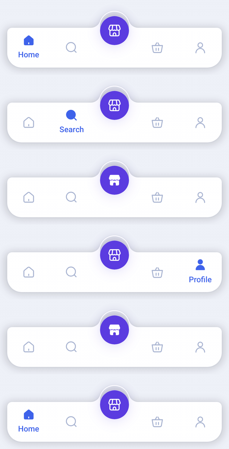
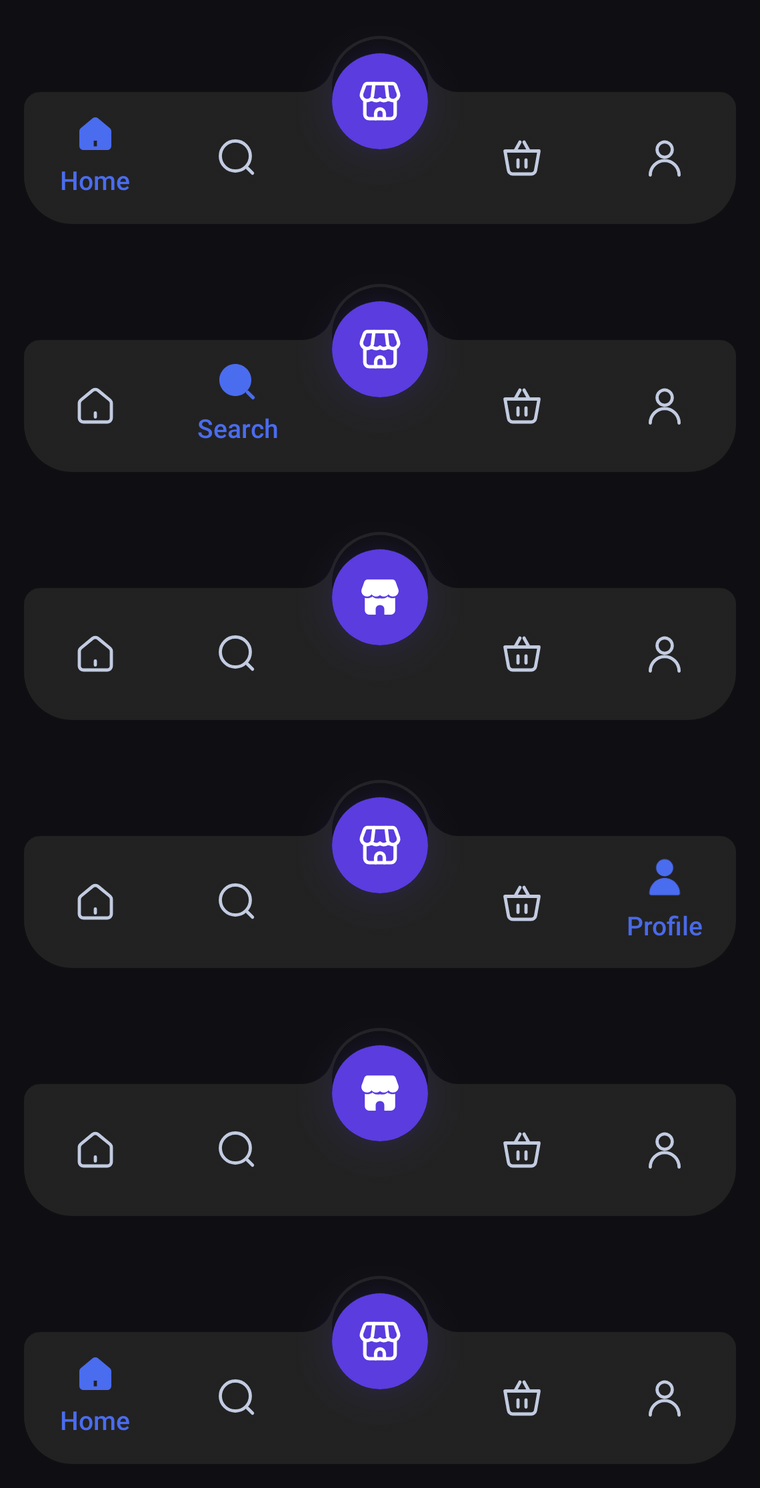
A floating, rounded bar whose top edge rises into a thin rim arching over the glowing center orb, with a see-through crescent between them. Icon-only tabs; the selected icon lifts and fills in over its label, and a ring ripples out of the orb when it is selected.
Usage
OrbitBarItem works like DomeBarItem: the middle item becomes the orb inside the rim, so pass an odd number of items. Side tabs show only their icon, centered in the bar; the selected one lifts, switches to its selectedIcon and shows its label underneath.
import com.nameisjayant.bottombar.orbit.OrbitBarItem
import com.nameisjayant.bottombar.orbit.OrbitBottomBar
import com.nameisjayant.bottombar.orbit.OrbitBottomBarDefaultsval items = listOf(
OrbitBarItem("Home", Icons.Outlined.Home, Icons.Filled.Home),
OrbitBarItem("Search", Icons.Outlined.Search, Icons.Filled.Search),
OrbitBarItem("Store", Icons.Outlined.Storefront, Icons.Filled.Storefront), // the orb
OrbitBarItem("Cart", Icons.Outlined.ShoppingCart, Icons.Filled.ShoppingCart),
OrbitBarItem("Profile", Icons.Outlined.Person, Icons.Filled.Person),
)
OrbitBottomBar(
items = items,
selectedIndex = selectedIndex,
onItemClick = { selectedIndex = it },
// The bottom corners are rounded, so it looks best floating a little above the screen edge.
modifier = Modifier.padding(start = 12.dp, end = 12.dp, bottom = 12.dp),
shadowElevation = 8.dp,
)Sizing and behavior
The bar is BarHeight (66dp) tall plus DomeRise (28dp) for the rim, all inside its own bounds. The orb is OrbSize (48dp). Above it sits a RimWidth (1.5dp) rim, a circle as wide as the orb lifted MoatLift (7dp) higher, so the gap between them is a crescent: widest over the orb and narrowing to nothing at its sides. The crescent is cut out of the bar, so whatever is behind the bar shows through it. shadowElevation defaults to 0.dp; the outline is concave, which Android can only cast a shadow for on API 30+.
Colors
Colors come from OrbitBottomBarDefaults.colors(darkTheme), lightColors(...) and darkColors(...). Start from either palette and override only what you need.
| Color | Used for |
|---|---|
containerColor | The bar and its rim |
selectedContentColor | Icon and label of the selected side tab |
unselectedContentColor | Icons of the other side tabs |
orbColor | Fill of the center orb, and the ring that ripples out when it is selected |
orbContentColor | Icon inside the orb |
OrbitBottomBar(
    items = items,
    selectedIndex = selectedIndex,
    onItemClick = { selectedIndex = it },
    // Follow your app's theme instead of the system one.
    colors = OrbitBottomBarDefaults.colors(darkTheme = isDarkTheme),
)
API
The full signature of the composable and its item class:
fun OrbitBottomBar(
    items: List<OrbitBarItem>,
    selectedIndex: Int,
    onItemClick: (index: Int) -> Unit,
    modifier: Modifier = Modifier,
    colors: OrbitBottomBarColors = OrbitBottomBarDefaults.colors(),
    labelStyle: TextStyle = OrbitBottomBarDefaults.LabelStyle,
    shadowElevation: Dp = 0.dp,
    windowInsets: WindowInsets = OrbitBottomBarDefaults.windowInsets,
)

class OrbitBarItem(
    val label: String,
    val icon: ImageVector,
    val selectedIcon: ImageVector = icon,
)