Docs / Bottom bars / 12
BeadBottomBar
Flat bar with a small notch over the selected tab, holding a bead that hops from tab to tab.
Preview
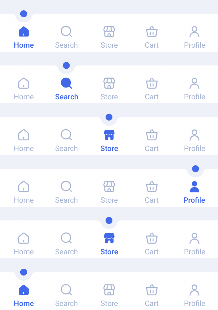
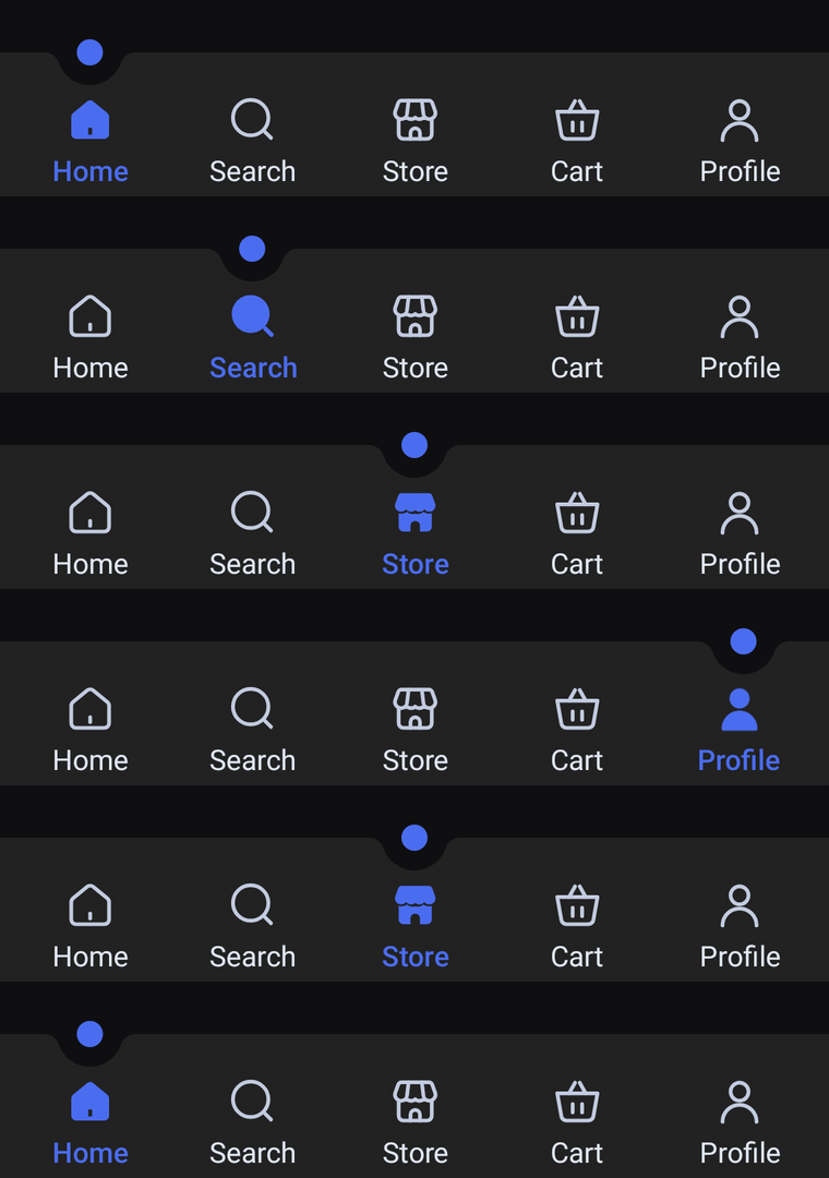
A flat bar with a small round notch cut into its top edge over the selected tab, holding an accent bead. Icons and labels always show; the notch glides to the new tab while the bead hops along with it, and the tab fills in and turns the accent color.
Usage
BeadBarItem has no center item: any tab can be selected, and every slot gets the same width. Every tab shows its icon and label; the selected one switches to its selectedIcon and takes selectedContentColor.
import com.nameisjayant.bottombar.bead.BeadBarItem
import com.nameisjayant.bottombar.bead.BeadBottomBar
import com.nameisjayant.bottombar.bead.BeadBottomBarDefaultsval items = listOf(
BeadBarItem("Home", Icons.Outlined.Home, Icons.Filled.Home),
BeadBarItem("Search", Icons.Outlined.Search, Icons.Filled.Search),
BeadBarItem("Shop", Icons.Outlined.Storefront, Icons.Filled.Storefront),
BeadBarItem("Cart", Icons.Outlined.ShoppingCart, Icons.Filled.ShoppingCart),
BeadBarItem("Profile", Icons.Outlined.Person, Icons.Filled.Person),
)
BeadBottomBar(
items = items,
selectedIndex = selectedIndex,
onItemClick = { selectedIndex = it },
)Sizing and behavior
The bar is BarHeight (66dp) tall. The BeadSize (12dp) bead sits centered on the top edge in a notch of NotchRadius (15dp), rounded off by NotchShoulderRadius (7dp) shoulders. When the selection changes the bead hops up to HopHeight (10dp) on its way to the new tab, so leave a little room above the bar. As with Socket, shadowElevation defaults to 0.dp and needs API 30+ because of the concave outline.
Colors
Colors come from BeadBottomBarDefaults.colors(darkTheme), lightColors(...) and darkColors(...). Start from either palette and override only what you need.
| Color | Used for |
|---|---|
containerColor | The bar background |
beadColor | The bead in the notch |
selectedContentColor | Icon and label of the selected tab (defaults to beadColor) |
unselectedContentColor | Icons of the other tabs |
unselectedLabelColor | Labels of the other tabs |
BeadBottomBar(
    items = items,
    selectedIndex = selectedIndex,
    onItemClick = { selectedIndex = it },
    // Follow your app's theme instead of the system one.
    colors = BeadBottomBarDefaults.colors(darkTheme = isDarkTheme),
)
API
The full signature of the composable and its item class:
fun BeadBottomBar(
    items: List<BeadBarItem>,
    selectedIndex: Int,
    onItemClick: (index: Int) -> Unit,
    modifier: Modifier = Modifier,
    colors: BeadBottomBarColors = BeadBottomBarDefaults.colors(),
    labelStyle: TextStyle = BeadBottomBarDefaults.LabelStyle,
    shadowElevation: Dp = 0.dp,
    windowInsets: WindowInsets = BeadBottomBarDefaults.windowInsets,
)

class BeadBarItem(
    val label: String,
    val icon: ImageVector,
    val selectedIcon: ImageVector = icon,
)