
Docs / Components / 02
ComposeWheelPicker
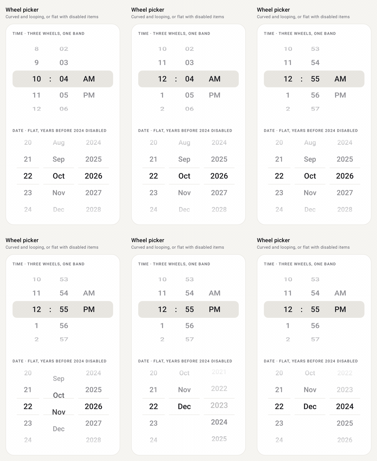
A scrolling wheel for picking one item from a list: hours, minutes, months, sizes, anything. Drag or fling it and it snaps so a row rests on the selection line. Tap a row to spin to it.
Preview
How it works
- Two ways to hold the selection. Pass
selectedIndex+onSelectedIndexChangewhen you only need the final value (the callback runs once the wheel comes to rest). UserememberComposeWheelPickerState()when you want the index live while it spins, or want to scroll it from code withanimateScrollToIndex/scrollToIndex. - It always lands on a row. A drag or fling decays and snaps so one row rests on the selection line; tapping a row spins to it. Each row that passes the line gives a light haptic tick.
- Endless lists.
cyclic = truewraps the list so it spins in both directions forever, and scrolling from code takes the short way round. - Lists can change while shown. If
itemschanges (31 days becoming 28), the wheel keeps its item, or moves to the last one if the list got shorter.isItemEnableddims rows and the wheel skips over them. - Looks.
WheelPickerStyle.Wheelcurves rows like a drum,Flatshrinks and fades them. TheselectionIndicatorslot draws behind the selected row and can be turned off so several wheels share one band.
Setup
Add the library once (see Getting started), then import from com.nameisjayant.components.wheelpicker:
import com.nameisjayant.components.wheelpicker.*Quick start
var month by rememberSaveable { mutableIntStateOf(0) }

ComposeWheelPicker(
    items = listOf("Jan", "Feb", "Mar", "Apr", "May", "Jun", "Jul", "Aug", "Sep", "Oct", "Nov", "Dec"),
    selectedIndex = month,
    onSelectedIndexChange = { month = it },    // called once the wheel comes to rest
)
Change month from outside and the wheel spins to it.
With a state: live selection and scrolling from code
val minutes = rememberComposeWheelPickerState(initialIndex = 30)
val scope = rememberCoroutineScope()

ComposeWheelPicker(
    items = (0..59).map { "%02d".format(it) },
    state = minutes,
    cyclic = true,                             // loops forever in both directions
)

minutes.selectedIndex                          // follows the wheel live, even mid-fling
minutes.isScrollInProgress
scope.launch { minutes.animateScrollToIndex(0) } // or scrollToIndex(0) to jump; cyclic takes the short way round
Several wheels as one picker
Turn each wheel's own indicator off and draw one band behind the row, one itemHeight tall:
Box(contentAlignment = Alignment.Center) {
    ComposeWheelPickerDefaults.SelectionBand(Modifier.fillMaxWidth().height(ComposeWheelPickerDefaults.ItemHeight))
    Row(verticalAlignment = Alignment.CenterVertically) {
        ComposeWheelPicker(items = (1..12).toList(), state = hours, cyclic = true, selectionIndicator = null,
            modifier = Modifier.width(72.dp), contentDescription = "Hours")
        Text(":", style = MaterialTheme.typography.titleLarge)
        ComposeWheelPicker(items = (0..59).map { "%02d".format(it) }, state = minutes, cyclic = true,
            selectionIndicator = null, modifier = Modifier.width(72.dp), contentDescription = "Minutes")
        ComposeWheelPicker(items = listOf("AM", "PM"), state = amPm, selectionIndicator = null,
            modifier = Modifier.width(72.dp))
    }
}
Flat style, disabled items and lists that change
val days = (1..CalendarMonth(year, month).lengthOfMonth).toList()  // the list can change, e.g. 31 → 28

ComposeWheelPicker(
    items = days,
    state = dayState,                                  // keeps its item, or the last one if the list got shorter
    style = WheelPickerStyle.Flat,                     // rows shrink and fade instead of curving
    selectionIndicator = { ComposeWheelPickerDefaults.SelectionLines() },
    isItemEnabled = { index -> days[index] >= earliestDay }, // dimmed and skipped
)
WheelPickerStyle(curved, outerAlpha, outerScale) lets you tune the look between Wheel and Flat.
Custom rows
ComposeWheelPicker(items = sizes, state = state) { item: WheelPickerItem<Size> ->
    Row(verticalAlignment = Alignment.CenterVertically) {
        Text(item.value.label, fontWeight = if (item.isSelected) FontWeight.Bold else null)
        if (!item.isEnabled) Text("  sold out", style = MaterialTheme.typography.labelSmall)
    }
}
Custom rows still curve and fade with the wheel, and get the selected or plain text color as LocalContentColor.
All parameters
| Parameter | Default | Description |
|---|---|---|
items | Any List<T>; may change while shown | |
state or selectedIndex + onSelectedIndexChange | Pick the overload you need. The state overload also takes an optional onSelectedIndexChange | |
modifier | Set the width here; without one it's ComposeWheelPickerDefaults.Width (96dp). Height is itemHeight × visibleItemCount | |
enabled | true | Ignore touch and use disabled colors when false |
cyclic | false | Wrap the list so it spins endlessly |
visibleItemCount | 5 | Rows shown at once; must be odd |
itemHeight | 48.dp | Height of each row |
style | WheelPickerStyle.Wheel | Wheel (curved drum), Flat, or WheelPickerStyle(curved, outerAlpha, outerScale) |
textStyle / selectedTextStyle | titleLarge, centered | Label styles; their color comes from colors |
colors | ComposeWheelPickerDefaults.colors() | textColor, selectedTextColor, disabledItemTextColor, disabledTextColor, indicatorColor, indicatorLineColor |
selectionIndicator | SelectionBand() | Drawn behind the selected row; SelectionLines(), your own, or null |
fadeEdges | true | Fade rows out at the top and bottom |
isItemEnabled | all enabled | Disabled items are dimmed and skipped |
selectOnTap | true | Tapping a row spins to it |
hapticFeedbackEnabled | true | A light tick each time a row passes the line |
flingBehavior | snap fling | State overload only; how a fling decays and snaps |
contentDescription | null | What the wheel picks ("Hours"), read out with the selected label |
itemLabel | toString() | Text of each row, also used for accessibility |
itemContent | null | @Composable (WheelPickerItem<T>) -> Unit with index, value, isSelected, isEnabled |
Accessibility: the wheel is one adjustable control. Screen readers read the description and the selected label, and swipe up or down to change it.
API
The public signatures, straight from the library sources:
@Composable
public fun <T> ComposeWheelPicker(
    items: List<T>,
    modifier: Modifier = Modifier,
    state: ComposeWheelPickerState = rememberComposeWheelPickerState(),
    onSelectedIndexChange: ((Int) -> Unit)? = null,
    enabled: Boolean = true,
    cyclic: Boolean = false,
    visibleItemCount: Int = ComposeWheelPickerDefaults.VisibleItemCount,
    itemHeight: Dp = ComposeWheelPickerDefaults.ItemHeight,
    style: WheelPickerStyle = WheelPickerStyle.Wheel,
    textStyle: TextStyle = ComposeWheelPickerDefaults.textStyle(),
    selectedTextStyle: TextStyle = textStyle,
    colors: ComposeWheelPickerColors = ComposeWheelPickerDefaults.colors(),
    selectionIndicator: (@Composable () -> Unit)? = {
        ComposeWheelPickerDefaults.SelectionBand(color = colors.indicatorColor)
    },
    fadeEdges: Boolean = true,
    isItemEnabled: (index: Int) -> Boolean = { true },
    selectOnTap: Boolean = true,
    hapticFeedbackEnabled: Boolean = true,
    flingBehavior: FlingBehavior = ComposeWheelPickerDefaults.flingBehavior(state),
    contentDescription: String? = null,
    itemLabel: (T) -> String = { it.toString() },
    itemContent: (@Composable (WheelPickerItem<T>) -> Unit)? = null,
)

@Composable
public fun <T> ComposeWheelPicker(
    items: List<T>,
    selectedIndex: Int,
    onSelectedIndexChange: (Int) -> Unit,
    modifier: Modifier = Modifier,
    enabled: Boolean = true,
    cyclic: Boolean = false,
    visibleItemCount: Int = ComposeWheelPickerDefaults.VisibleItemCount,
    itemHeight: Dp = ComposeWheelPickerDefaults.ItemHeight,
    style: WheelPickerStyle = WheelPickerStyle.Wheel,
    textStyle: TextStyle = ComposeWheelPickerDefaults.textStyle(),
    selectedTextStyle: TextStyle = textStyle,
    colors: ComposeWheelPickerColors = ComposeWheelPickerDefaults.colors(),
    selectionIndicator: (@Composable () -> Unit)? = {
        ComposeWheelPickerDefaults.SelectionBand(color = colors.indicatorColor)
    },
    fadeEdges: Boolean = true,
    isItemEnabled: (index: Int) -> Boolean = { true },
    selectOnTap: Boolean = true,
    hapticFeedbackEnabled: Boolean = true,
    contentDescription: String? = null,
    itemLabel: (T) -> String = { it.toString() },
    itemContent: (@Composable (WheelPickerItem<T>) -> Unit)? = null,
)

@Composable
public fun rememberComposeWheelPickerState(initialIndex: Int