
Docs / Components / 05
ComposeTimeline
Steps joined by a line: order tracking, onboarding progress, a history of events. Each step gets an indicator on the line, content beside it and, optionally, opposite content on the other side. The line is drawn as reached up to the furthest reached step, and grows into the next step when it's reached.
Preview
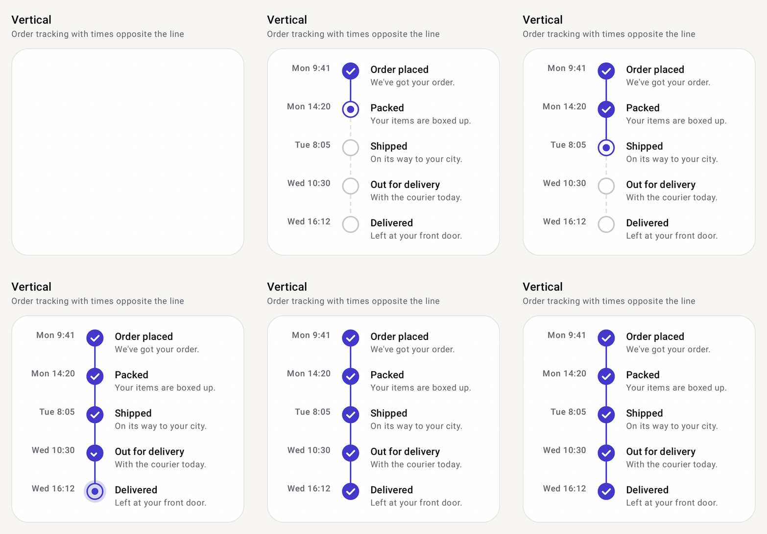
How it works
- You give items, it gives steps.
itemscan be any type. For each one,content(and optionaloppositeContent) receives aTimelineStepwith the item, itsindex, itsstateand where it sits (isFirst,isLast,contentSide). - Each step has a state.
stepStatereturnsCompleted,Active(the indicator pulses),UpcomingorError.TimelineStepState.forProgress(index, currentIndex)covers the usual case: steps before the current one are done, the current one is active, later ones upcoming. - The line follows progress. It's drawn as reached up to the furthest reached step and in
pendingLineStyleafter it. WhencurrentStepmoves forward, the line animates into the next step. - Indicators are a slot. The default
StatusIndicatordraws a ring, pulsing dot, check or!. Swap inNumberIndicator,IconIndicatoror your own composable; the slot's scope gives you the colors,indicatorSizeand animation. - Short or long.
ComposeTimelinelays out every step at once (vertical or horizontal). For long vertical lists,timelineItems(...)adds the steps straight into aLazyColumn.
Setup
Add the library once (see Getting started), then import from com.nameisjayant.components.timeline:
import com.nameisjayant.components.timeline.*Quick start
ComposeTimeline(
    items = orderSteps,
    stepState = { index, _ -> TimelineStepState.forProgress(index, currentStep) },
    pendingLineStyle = TimelineLineStyle.Dashed,             // the line after the current step
    oppositeContent = { step -> Text(step.item.time) },
) { step ->
    Text(step.item.title, style = MaterialTheme.typography.titleSmall)
    Text(step.item.description, style = MaterialTheme.typography.bodySmall)
}
TimelineStepState is Completed, Active (pulses), Upcoming or Error. forProgress(index, currentIndex) makes earlier steps completed, the current one active and later ones upcoming; pass currentIndex = items.size to complete them all. Bump currentStep and the line fills into the next step.
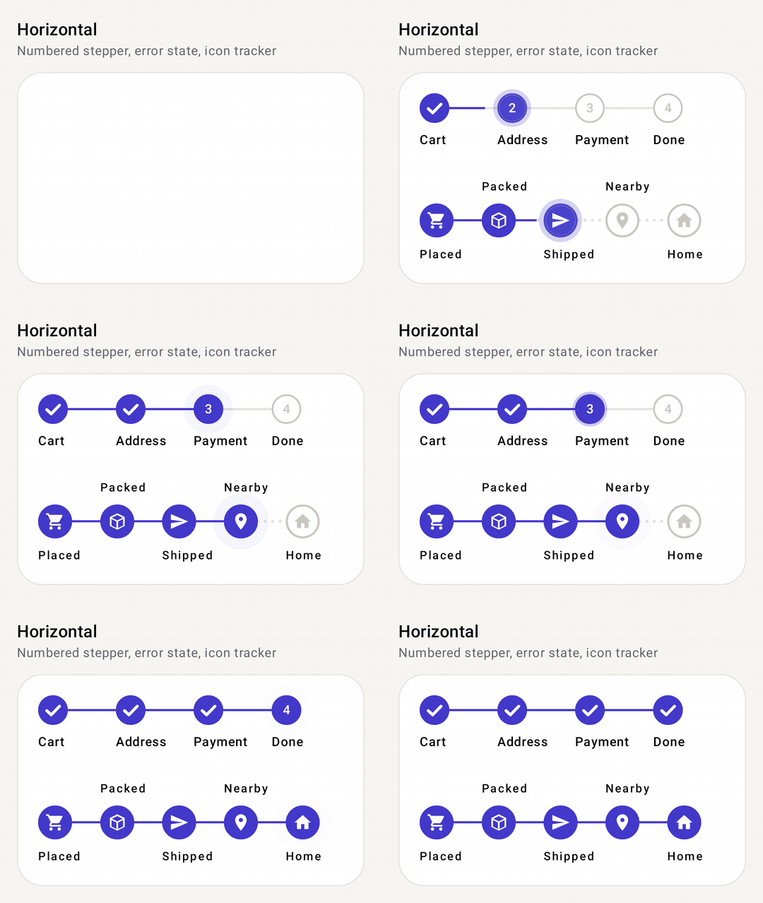
Horizontal stepper
ComposeTimeline(
    items = listOf("Cart", "Address", "Payment", "Done"),
    orientation = TimelineOrientation.Horizontal,
    stepState = { index, _ -> if (index == current && paymentFailed) TimelineStepState.Error else TimelineStepState.forProgress(index, current) },
    indicatorSize = 28.dp,
    indicator = { step ->
        if (step.state == TimelineStepState.Completed) StatusIndicator(step.state)
        else NumberIndicator("${step.index + 1}", step.state)
    },
) { step -> Text(step.item) }
Horizontal steps share the width equally; give them an itemWidth to put a long timeline in a horizontally scrolling container. Tracks line up however tall the content above them is.
Indicators and lines
indicator = { step -> StatusIndicator(step.state) }                       // default: ring, pulsing dot, check, "!"
indicator = { step -> NumberIndicator("${step.index + 1}", step.state) }
indicator = { step -> IconIndicator(painterResource(R.drawable.ic_truck), step.state) } // Painter or ImageVector
indicator = { step -> MyBadge(step, colors.completedColor, indicatorSize) }  // the scope has colors, indicatorSize, animation

lineStyle = TimelineLineStyle.Solid                                       // reached part
pendingLineStyle = TimelineLineStyle.Dotted                               // the rest
TimelineLineStyle(width = 3.dp, dashLength = 8.dp, gapLength = 4.dp, cap = StrokeCap.Round)
Layout options
ComposeTimeline(
    items = events,
    contentSide = TimelineContentSide.Alternate,               // Start | End | Alternate (line down the middle)
    indicatorAlignment = TimelineIndicatorAlignment.Center,    // level with the start of the content, or centered
    itemSpacing = 24.dp, contentSpacing = 16.dp, lineGap = 4.dp,
    oppositeContentFraction = 0.3f,
    key = { it.id },                                           // keeps animations when items move
) { step -> EventCard(step.item, alignEnd = step.contentSide == TimelineContentSide.Start) }
Long timelines in a LazyColumn
LazyColumn(contentPadding = PaddingValues(16.dp)) {
    item { Header() }
    timelineItems(events, key = { it.id }) { step -> EventCard(step.item) }
    item { LoadMore() }
}
timelineItems takes the same parameters as the vertical ComposeTimeline, plus contentType.
All parameters
| Parameter | Default | Description |
|---|---|---|
items | One per step | |
stepState | all Completed | (index, item) -> TimelineStepState |
key | null | Stable key per item |
orientation | Vertical | Vertical or Horizontal |
contentSide | End | Start, End or Alternate (start/end edges vertically, above/below horizontally) |
indicatorAlignment | Start | Start or Center relative to the content |
indicatorSize | 24.dp | Default indicator size, and the width of the line's track |
itemSpacing / contentSpacing / lineGap | 24.dp / 16.dp / 0.dp | Gaps between steps, beside the line, and around indicators |
itemWidth | Dp.Unspecified | Horizontal only; unspecified shares the width |
oppositeContentFraction | 0.3f | Share of the space that opposite content gets |
lineStyle / pendingLineStyle | Solid / lineStyle | Solid, Dashed, Dotted or TimelineLineStyle(width, dashLength, gapLength, cap) |
colors | ComposeTimelineDefaults.colors() | completedColor, onCompletedColor, activeColor, onActiveColor, upcomingColor, errorColor, onErrorColor, containerColor, completedLineColor, upcomingLineColor, haloColor |
animation | TimelineAnimation.Default | TimelineAnimation(revealItems, staggerMillis, lineFillMillis, pulseActive) or .None |
indicator | StatusIndicator | TimelineIndicatorScope.(TimelineStep<T>) -> Unit |
oppositeContent | null | Drawn on the other side of the line |
content | Drawn beside each indicator |
TimelineStep<T> has index, item, state, count, contentSide, orientation, isFirst and isLast. Each step reads to screen readers as one item with its state ("Completed", "In progress"…) and its place in the list. Right-to-left layouts mirror everything.
API
The public signatures, straight from the library sources:
@Composable
public fun <T> ComposeTimeline(
    items: List<T>,
    modifier: Modifier = Modifier,
    stepState: (index: Int, item: T) -> TimelineStepState = { _, _ -> TimelineStepState.Completed },
    key: ((item: T) -> Any)? = null,
    orientation: TimelineOrientation = TimelineOrientation.Vertical,
    contentSide: TimelineContentSide = TimelineContentSide.End,
    indicatorAlignment: TimelineIndicatorAlignment = TimelineIndicatorAlignment.Start,
    indicatorSize: Dp = ComposeTimelineDefaults.IndicatorSize,
    itemSpacing: Dp = ComposeTimelineDefaults.ItemSpacing,
    contentSpacing: Dp = ComposeTimelineDefaults.ContentSpacing,
    lineGap: Dp = 0.dp,
    itemWidth: Dp = Dp.Unspecified,
    oppositeContentFraction: Float = ComposeTimelineDefaults.OppositeContentFraction,
    lineStyle: TimelineLineStyle = TimelineLineStyle.Solid,
    pendingLineStyle: TimelineLineStyle = lineStyle,
    colors: ComposeTimelineColors = ComposeTimelineDefaults.colors(),
    animation: TimelineAnimation = TimelineAnimation.Default,
    indicator: @Composable TimelineIndicatorScope.(step: TimelineStep<T>) -> Unit = { StatusIndicator(it.state) },
    oppositeContent: (@Composable (step: TimelineStep<T>) -> Unit)? = null,
    content: @Composable (step: TimelineStep<T>) -> Unit,
)

public fun <T> LazyListScope.timelineItems(
    items: List<T>,
    stepState: (index: Int, item: T) -> TimelineStepState = { _, _ -> TimelineStepState.Completed },
    key: ((item: T) -> Any)? = null,
    contentType: (item: T) -> Any? = { null },
    contentSide: TimelineContentSide = TimelineContentSide.End,
    indicatorAlignment: TimelineIndicatorAlignment = TimelineIndicatorAlignment.Start,
    indicatorSize: Dp = ComposeTimelineDefaults.IndicatorSize,
    itemSpacing: Dp = ComposeTimelineDefaults.ItemSpacing,
    contentSpacing: Dp = ComposeTimelineDefaults.ContentSpacing,
    lineGap: Dp = 0.dp,
    oppositeContentFraction: Float = ComposeTimelineDefaults.OppositeContentFraction,
    lineStyle: TimelineLineStyle = TimelineLineStyle.Solid,
    pendingLineStyle: TimelineLineStyle = lineStyle,
    colors: ComposeTimelineColors? = null,
    animation: TimelineAnimation = TimelineAnimation.Default,
    indicator: @Composable TimelineIndicatorScope.(step: TimelineStep<T>) -> Unit = { StatusIndicator(it.state) },
    oppositeContent: (@Composable (step: TimelineStep<T>) -> Unit)? = null,
    content: @Composable (step: TimelineStep<T>) -> Unit,
)

@Composable
public fun TimelineIndicatorScope.StatusIndicator(
    state: TimelineStepState,
    modifier: Modifier = Modifier,
    size: Dp = indicatorSize,
)

@Composable
public fun TimelineIndicatorScope.NumberIndicator(
    text: String,
    state: TimelineStepState,
    modifier: Modifier = Modifier,
    size: Dp = indicatorSize,
    textStyle: TextStyle = MaterialTheme.typography.labelMedium,
)

@Composable
public fun TimelineIndicatorScope.IconIndicator(
    painter: Painter,
    state: TimelineStepState,
    modifier: Modifier = Modifier,
    size: Dp = indicatorSize,
    iconSize: Dp = size * 0.58f,
    contentDescription: String? = null,
)

@Composable
public fun TimelineIndicatorScope.IconIndicator(
    imageVector: ImageVector,
    state: TimelineStepState,
    modifier: Modifier = Modifier,
    size: Dp = indicatorSize,
    iconSize: Dp = size * 0.58f,
    contentDescription: String? = null,
)