
Docs / Components / 03
ComposeOtpInput
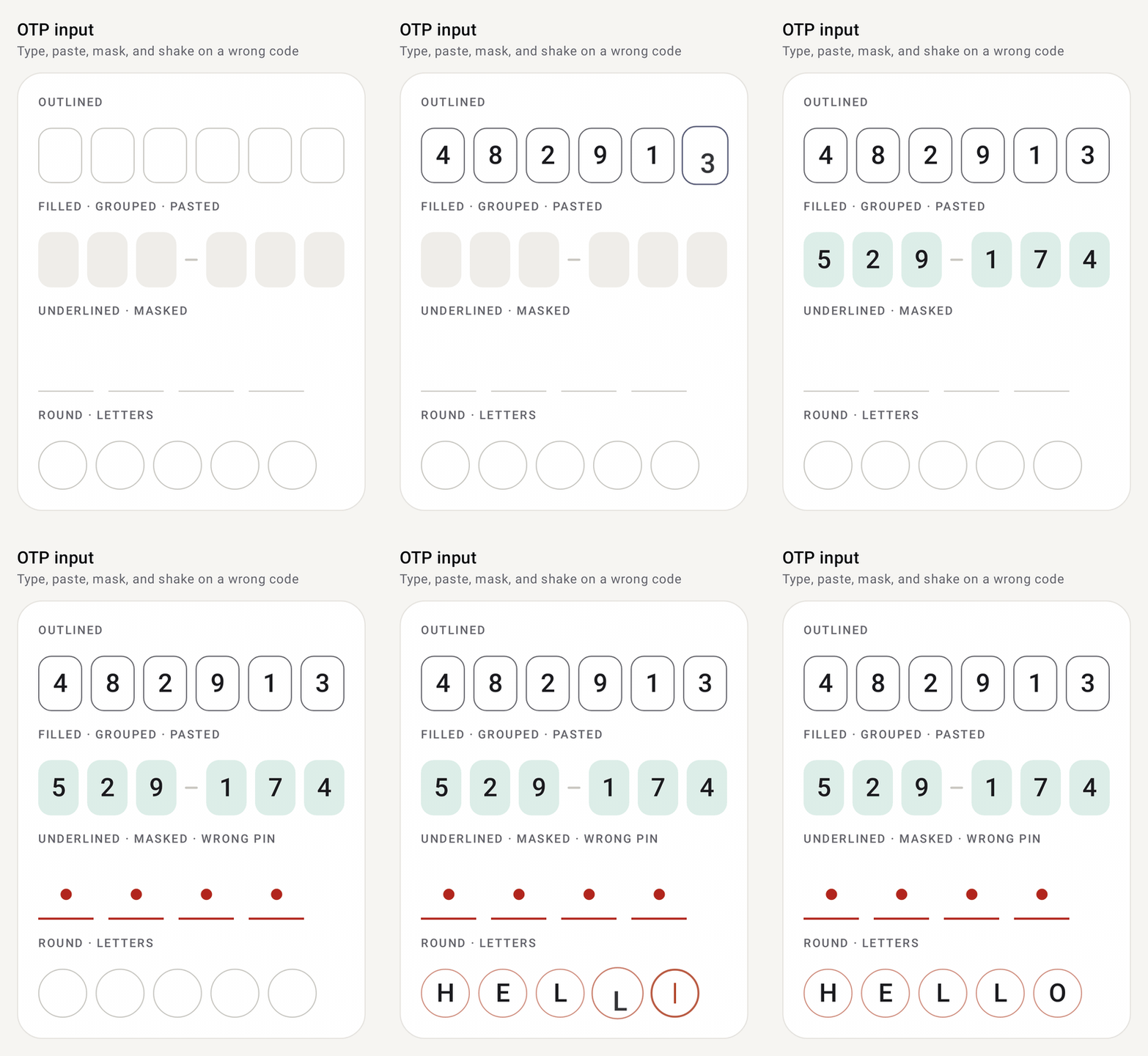
A one-time-code field split into cells. Typing fills the cells one by one, backspace clears them, and pasting or SMS autofill drops a whole code in at once. Characters the input doesn't accept, such as the dash in 529-174, are skipped.
Preview
How it works
- One hidden text field behind the cells. The cells are drawn from a single
valuestring, so you keep the code in your own state and update it fromonValueChange. The cursor always sits at the end of the code. - Pasting just works. Pasting a full code, or an SMS autofill, replaces what's there. Characters the input doesn't accept, like the dash in
529-174, are dropped, so the code still fills the cells. onCompletefires once when the last cell is filled, and the keyboard closes (clearFocusOnComplete). That's where you verify the code.- Errors are visible and felt. Set
isError = trueand the cells turn red, the row shakes and the phone buzzes once. Reset it inonValueChangewhen the user edits. - Shape it to your screen. Choose
Outlined,FilledorUnderlinedcells, split them into groups with a separator, mask a PIN, accept letters or your owncharFilter, or draw each cell yourself withcellContent.
Setup
Add the library once (see Getting started), then import from com.nameisjayant.components.otpinput:
import com.nameisjayant.components.otpinput.*Quick start
var code by rememberSaveable { mutableStateOf("") }

ComposeOtpInput(
    value = code,
    onValueChange = { code = it },
    onComplete = { viewModel.verify(it) },   // called when the last cell is filled; the keyboard closes
)
Error state
ComposeOtpInput(
    value = code,
    onValueChange = { code = it; wrongCode = false },
    isError = wrongCode,                     // red cells, the row shakes and the phone buzzes when it turns true
)
Styles, groups and sizing
ComposeOtpInput(
    value = code,
    onValueChange = { code = it },
    length = 6,
    cellStyle = OtpCellStyle.Filled,                                    // Outlined | Filled | Underlined
    colors = ComposeOtpInputDefaults.accentColors(Color(0xFF0F8A66), OtpCellStyle.Filled),
    cellSize = DpSize(Dp.Unspecified, 52.dp),                           // unspecified width = share the row
    groupSize = 3,                                                      // 529 – 174
    separator = { ComposeOtpInputDefaults.Separator() },
)

// Round cells
ComposeOtpInput(code, { code = it }, cellShape = ComposeOtpInputDefaults.CircleCellShape, cellSize = DpSize(46.dp, 46.dp))
Pass the same style to colors(style) / accentColors(accent, style) as to cellStyle; they pick suitable container and border colors for it.
PINs and other input types
// Masked PIN that shows each digit for a moment
ComposeOtpInput(value = pin, onValueChange = { pin = it }, length = 4, mask = true, revealMillis = 600)

// Letters, uppercased as they're typed or pasted
ComposeOtpInput(value = code, onValueChange = { code = it }, inputType = OtpInputType.Letters, uppercase = true)

// Your own rule, e.g. hex characters
ComposeOtpInput(value = code, onValueChange = { code = it }, inputType = OtpInputType.Any,
    charFilter = { it.isDigit() || it.lowercaseChar() in 'a'..'f' })
OtpInputType is Digits (number pad), Letters, Alphanumeric or Any.
Custom cells
// PIN dots instead of boxes
ComposeOtpInput(value = pin, onValueChange = { pin = it }, length = 4) { cell: OtpCell ->
    Box(
        Modifier
            .size(16.dp)
            .background(if (cell.isFilled) MaterialTheme.colorScheme.primary else Color.Transparent, CircleShape)
            .border(2.dp, if (cell.isActive) MaterialTheme.colorScheme.primary else MaterialTheme.colorScheme.outline, CircleShape),
    )
}
OtpCell has index, char, text (masked if needed), isActive, isFilled, isError and isEnabled.
All parameters
| Parameter | Default | Description |
|---|---|---|
value / onValueChange | The code, and the callback with the new code | |
length | 6 | Number of cells |
onComplete | null | Called once with the full code when the last cell is filled |
enabled / readOnly | true / false | Disabled ignores focus; read-only can be focused and copied but not changed |
isError | false | Error colors, plus a shake and a buzz when it turns true |
inputType | Digits | Accepted characters and default keyboard |
charFilter | inputType::accepts | Overrides which characters are accepted |
uppercase | false | Capitalise letters |
mask / maskChar / revealMillis | false / ● / 600 | Password-style masking, briefly showing the last character |
placeholder | null | Character shown in empty cells, e.g. '0' |
cellStyle | Outlined | Outlined, Filled or Underlined |
cellSize | 48 × 56 dp | Dp.Unspecified width shares the row; unspecified height makes cells square |
cellSpacing | 8.dp | Gap between cells and around separators |
cellShape | RoundedCornerShape(12.dp) | CircleCellShape for round cells |
borderWidth / focusedBorderWidth | 1.dp / 2.dp | Idle and active/error borders (or underlines) |
textStyle | headlineSmall, medium | Its color comes from colors |
colors | colors(cellStyle) | Container, border and text colors for idle, focused, filled, error and disabled cells, plus placeholderColor and cursorColor |
groupSize / separator | 0 / dash | Split into groups with a separator between them |
showCursor | true | Blinking cursor in the active cell |
autoFocus | false | Focus and open the keyboard on first show |
clearFocusOnComplete | true | Close the keyboard when complete |
keyboardType / imeAction / keyboardActions | from inputType / Done / default | Keyboard options |
animation | OtpInputAnimation.Default | OtpInputAnimation(slideInText, popScale, blinkCursor, shakeOnError, shakeDistance) or .None |
hapticFeedbackEnabled | true | Confirm tick when complete, buzz on error |
interactionSource | null | Observe focus and press interactions |
cellContent | null | @Composable (OtpCell) -> Unit to draw cells yourself |
Cells always run left to right, also in right-to-left layouts, since codes are read that way. The field tells autofill services it holds an SMS one-time code.
API
The public signatures, straight from the library sources:
@Composable
public fun ComposeOtpInput(
    value: String,
    onValueChange: (String) -> Unit,
    modifier: Modifier = Modifier,
    length: Int = 6,
    onComplete: ((String) -> Unit)? = null,
    enabled: Boolean = true,
    readOnly: Boolean = false,
    isError: Boolean = false,
    inputType: OtpInputType = OtpInputType.Digits,
    charFilter: (Char) -> Boolean = inputType::accepts,
    uppercase: Boolean = false,
    mask: Boolean = false,
    maskChar: Char = ComposeOtpInputDefaults.MaskChar,
    revealMillis: Long = ComposeOtpInputDefaults.RevealMillis,
    placeholder: Char? = null,
    cellStyle: OtpCellStyle = OtpCellStyle.Outlined,
    cellSize: DpSize = ComposeOtpInputDefaults.CellSize,
    cellSpacing: Dp = ComposeOtpInputDefaults.CellSpacing,
    cellShape: Shape = ComposeOtpInputDefaults.CellShape,
    borderWidth: Dp = ComposeOtpInputDefaults.BorderWidth,
    focusedBorderWidth: Dp = ComposeOtpInputDefaults.FocusedBorderWidth,
    textStyle: TextStyle = ComposeOtpInputDefaults.textStyle(),
    colors: ComposeOtpInputColors = ComposeOtpInputDefaults.colors(cellStyle),
    groupSize: Int = 0,
    separator: @Composable () -> Unit = { ComposeOtpInputDefaults.Separator() },
    showCursor: Boolean = true,
    autoFocus: Boolean = false,
    clearFocusOnComplete: Boolean = true,
    keyboardType: KeyboardType = inputType.keyboardType,
    imeAction: ImeAction = ImeAction.Done,
    keyboardActions: KeyboardActions = KeyboardActions.Default,
    animation: OtpInputAnimation = OtpInputAnimation.Default,
    hapticFeedbackEnabled: Boolean = true,
    interactionSource: MutableInteractionSource? = null,
    cellContent: (@Composable (OtpCell) -> Unit)? = null,
)