
Docs / Components / 06
ComposeColorPicker
A full color picker: a hue/saturation/brightness area in one of three styles, then an alpha slider, a before/after preview, a hex field and preset swatches. It works in HSV, so dragging to gray or black and back keeps the hue.
Preview
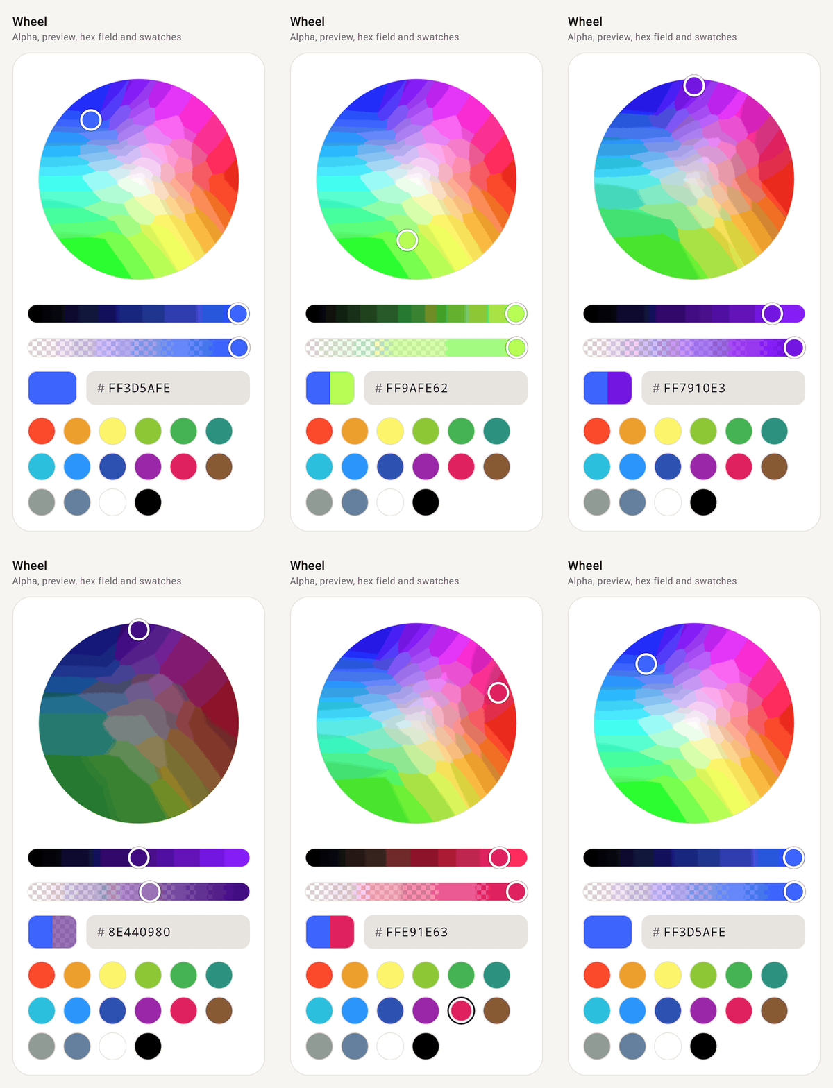
ColorPickerStyle.Wheel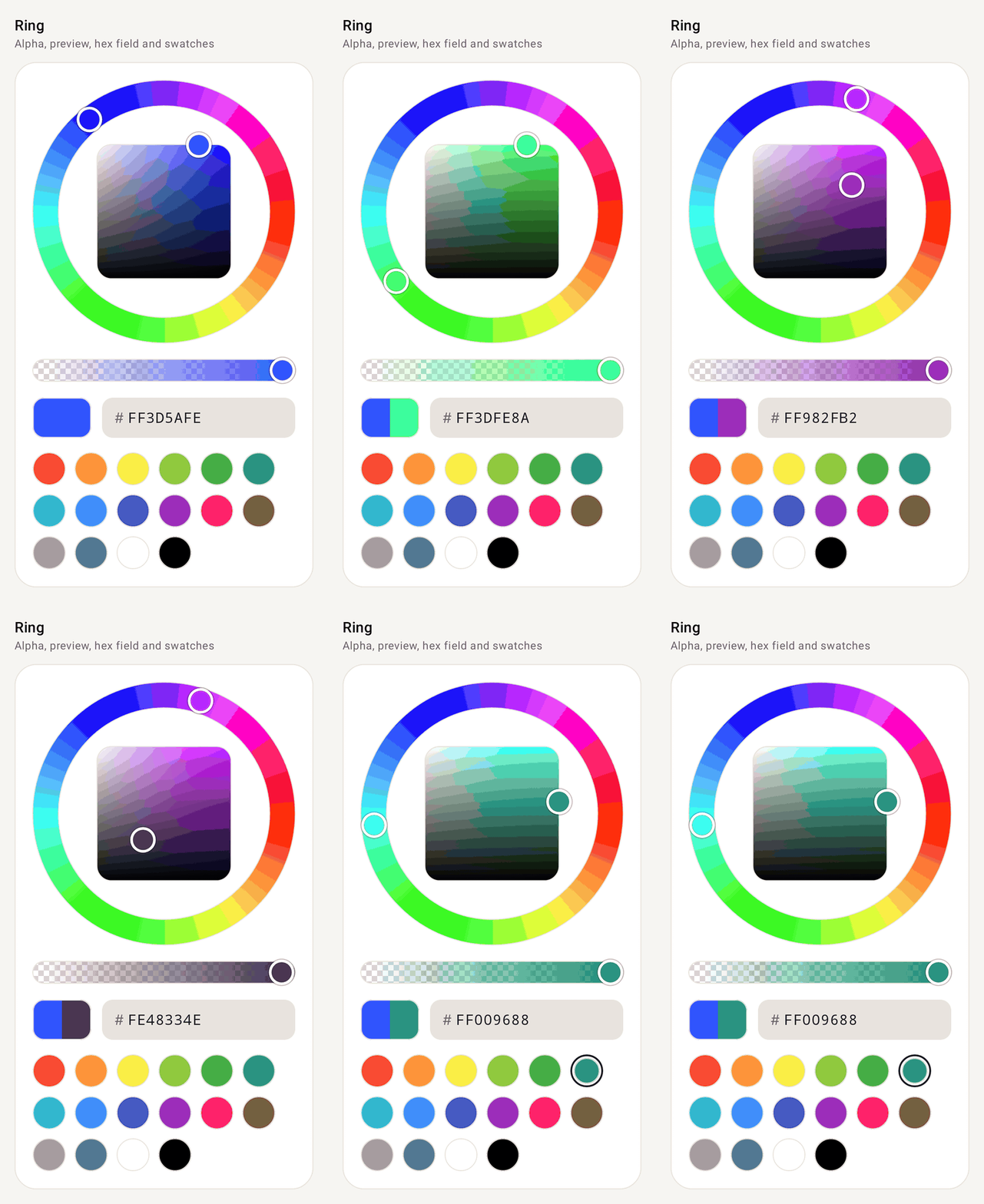
ColorPickerStyle.Ring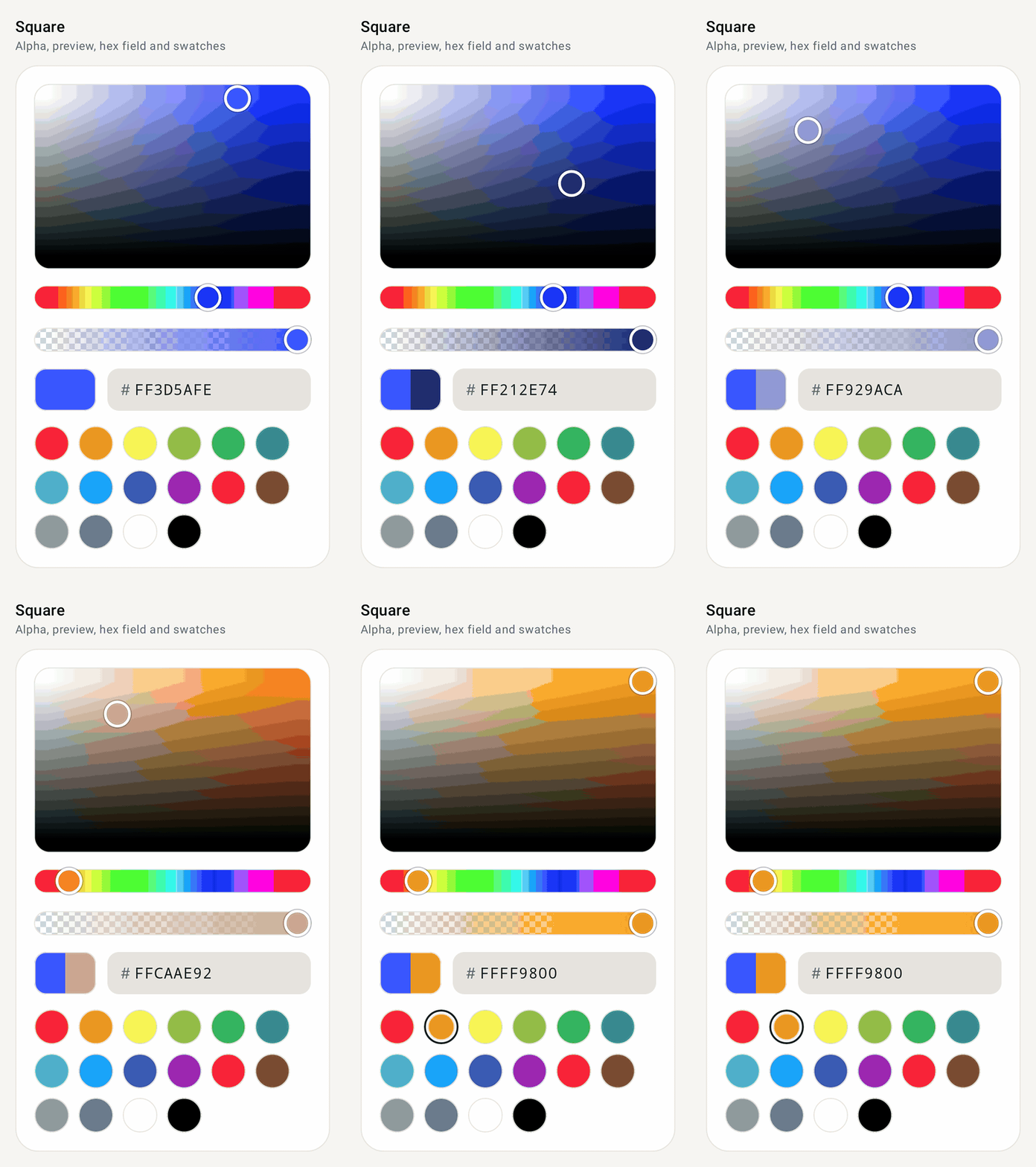
ColorPickerStyle.SquareHow it works
- Works in HSV. The picker stores hue, saturation, value and alpha (
HsvColor) rather than aColor, so dragging down to gray or black and back up keeps the hue you had. - Two ways to hold the color.
color+onColorChangefor a plain value, orrememberComposeColorPickerState()when you want to read and setstate.color/state.hsvColorat any time.onColorChangeFinishedruns when a drag ends, a swatch is tapped or a hex code is entered. - Three styles for the main area.
Wheelis a hue/saturation disc with a brightness slider,Ringis a hue ring around a saturation/brightness square, andSquareis a panel with a hue slider. - Toggle the extras. Alpha slider, before/after preview (
originalColor, tap the old half to go back), hex field and swatches can each be shown or hidden. - Or build your own. Every part (
SaturationValuePanel,HueSlider,AlphaSlider,ColorHexField,ColorSwatches…) is public and stateless, takinghsvColor+onHsvColorChange, so you can lay them out however you like.
Setup
Add the library once (see Getting started), then import from com.nameisjayant.components.colorpicker:
import com.nameisjayant.components.colorpicker.*Quick start
// Plain value + callback
var color by remember { mutableStateOf(Color(0xFF3D5AFE)) }
ComposeColorPicker(color = color, onColorChange = { color = it })

// Or a state you can read and set any time
val state = rememberComposeColorPickerState(initialColor = Color(0xFF3D5AFE))
ComposeColorPicker(
    state = state,
    style = ColorPickerStyle.Ring,                    // Wheel | Ring | Square
    originalColor = Color(0xFF3D5AFE),                // split preview; tap the old half to go back
    onColorChangeFinished = { recents.add(it) },      // finger lifted, swatch tapped or hex entered
)
state.color = Color.Red                               // or state.hsvColor = HsvColor(…)
Choose what's shown
ComposeColorPicker(
    state = state,
    showAlpha = false,                                  // no alpha slider; the hex field shows RRGGBB
    showPreview = true,
    showHexField = true,
    swatches = brandColors,                             // emptyList() for none
    colors = ComposeColorPickerDefaults.accentColors(MaterialTheme.colorScheme.tertiary),
    thumbSize = 24.dp, sliderHeight = 20.dp, ringWidth = 24.dp,
    panelShape = RoundedCornerShape(8.dp), swatchSize = 32.dp, spacing = 12.dp,
)
The hex field accepts RGB, ARGB, RRGGBB and AARRGGBB, with or without #. Codes without alpha keep the current alpha.
In a dialog
if (show) {
    val state = rememberComposeColorPickerState(initialColor = current)
    ComposeColorPickerDialog(
        onDismissRequest = { show = false },
        title = { Text("Pick a color") },
        confirmButton = { TextButton(onClick = { save(state.color); show = false }) { Text("OK") } },
        dismissButton = { TextButton(onClick = { show = false }) { Text("Cancel") } },
    ) {
        ComposeColorPicker(state, Modifier.padding(horizontal = 24.dp), originalColor = current)
    }
}
The dialog's content scrolls when the screen is too short for it.
Build your own picker from the parts
Every piece is public and stateless (hsvColor + onHsvColorChange), so you can lay them out however you like:
var hsv by remember { mutableStateOf(HsvColor.from(Color(0xFF3D5AFE))) }

Column(verticalArrangement = Arrangement.spacedBy(12.dp)) {
    SaturationValuePanel(hsv, { hsv = it }, aspectRatio = 2f)
    HueSlider(hsv, { hsv = it })
    SaturationSlider(hsv, { hsv = it })
    BrightnessSlider(hsv, { hsv = it })
    AlphaSlider(hsv, { hsv = it })
    Row(horizontalArrangement = Arrangement.spacedBy(12.dp)) {
        ColorPreview(hsv.toColor())
        ColorHexField(hsv, { hsv = it }, Modifier.weight(1f))
    }
    ColorSwatches(ComposeColorPickerDefaults.Swatches, selectedColor = hsv.toColor(), onSwatchClick = { hsv = HsvColor.from(it, hsv) })
}
Also available: HueSaturationWheel and HueRingPanel. HsvColor(hue, saturation, value, alpha) has toColor(), toArgb(), copy(...) and HsvColor.from(color, previous), which keeps the previous hue for grays.
All parameters
| Parameter | Default | Description |
|---|---|---|
state or color + onColorChange | Pick the overload you need | |
onColorChange | null | (state overload) Every change while dragging |
onColorChangeFinished | null | When a drag ends, a swatch is tapped or a hex code is entered |
style | Wheel | Wheel (disc + brightness slider), Ring (hue ring around a square), Square (panel + hue slider) |
enabled | true | Dimmed and ignores touch when false |
showAlpha / showPreview / showHexField | true | Toggle each section |
originalColor | null | Shown beside the current color in the preview; tap it to go back |
swatches | ComposeColorPickerDefaults.Swatches | 16 everyday colors; emptyList() hides the row |
colors | ComposeColorPickerDefaults.colors() | thumbColor, thumbBorderColor, borderColor, checkerboardLightColor, checkerboardDarkColor, selectedSwatchBorderColor, fieldContainerColor, fieldTextColor, fieldLabelColor, fieldBorderColor, fieldFocusedBorderColor |
thumbSize / sliderHeight / ringWidth | 28 / 24 / 28.dp | Thumb and track sizes |
panelShape | RoundedCornerShape(16.dp) | Corners of the saturation/brightness panel |
swatchSize / spacing | 36.dp / 16.dp | Swatch size and gap between sections |
The picker fills the width its modifier gives it. Sliders are adjustable for screen readers ("Hue, 210°", "Opacity, 80%"), panels read their hex code, and swatches are radio buttons named by their hex code. State survives configuration changes and process death, hue included.
API
The public signatures, straight from the library sources:
@Composable
public fun ComposeColorPicker(
    state: ComposeColorPickerState,
    modifier: Modifier = Modifier,
    onColorChange: ((Color) -> Unit)? = null,
    onColorChangeFinished: ((Color) -> Unit)? = null,
    style: ColorPickerStyle = ColorPickerStyle.Wheel,
    enabled: Boolean = true,
    showAlpha: Boolean = true,
    showPreview: Boolean = true,
    showHexField: Boolean = true,
    originalColor: Color? = null,
    swatches: List<Color> = ComposeColorPickerDefaults.Swatches,
    colors: ComposeColorPickerColors = ComposeColorPickerDefaults.colors(),
    thumbSize: Dp = ComposeColorPickerDefaults.ThumbSize,
    sliderHeight: Dp = ComposeColorPickerDefaults.SliderHeight,
    ringWidth: Dp = ComposeColorPickerDefaults.RingWidth,
    panelShape: Shape = ComposeColorPickerDefaults.PanelShape,
    swatchSize: Dp = ComposeColorPickerDefaults.SwatchSize,
    spacing: Dp = ComposeColorPickerDefaults.Spacing,
)

@Composable
public fun ComposeColorPicker(
    color: Color,
    onColorChange: (Color) -> Unit,
    modifier: Modifier = Modifier,
    onColorChangeFinished: ((Color) -> Unit)? = null,
    style: ColorPickerStyle = ColorPickerStyle.Wheel,
    enabled: Boolean = true,
    showAlpha: Boolean = true,
    showPreview: Boolean = true,
    showHexField: Boolean = true,
    originalColor: Color? = null,
    swatches: List<Color> = ComposeColorPickerDefaults.Swatches,
    colors: ComposeColorPickerColors = ComposeColorPickerDefaults.colors(),
    thumbSize: Dp = ComposeColorPickerDefaults.ThumbSize,
    sliderHeight: Dp = ComposeColorPickerDefaults.SliderHeight,
    ringWidth: Dp = ComposeColorPickerDefaults.RingWidth,
    panelShape: Shape = ComposeColorPickerDefaults.PanelShape,
    swatchSize: Dp = ComposeColorPickerDefaults.SwatchSize,
    spacing: Dp = ComposeColorPickerDefaults.Spacing,
)

@Composable
public fun rememberComposeColorPickerState(initialColor: Color

@Composable
public fun ComposeColorPickerDialog(
    onDismissRequest: () -> Unit,
    confirmButton: @Composable () -> Unit,
    modifier: Modifier = Modifier,
    dismissButton: (@Composable () -> Unit)? = null,
    title: (@Composable () -> Unit)? = null,
    shape: Shape = RoundedCornerShape(28.dp),
    containerColor: Color = MaterialTheme.colorScheme.surfaceContainerHigh,
    tonalElevation: Dp = 6.dp,
    properties: DialogProperties = DialogProperties(usePlatformDefaultWidth = false),
    content: @Composable ColumnScope.() -> Unit,
)