
Docs / Components / 04
ComposeRatingBar
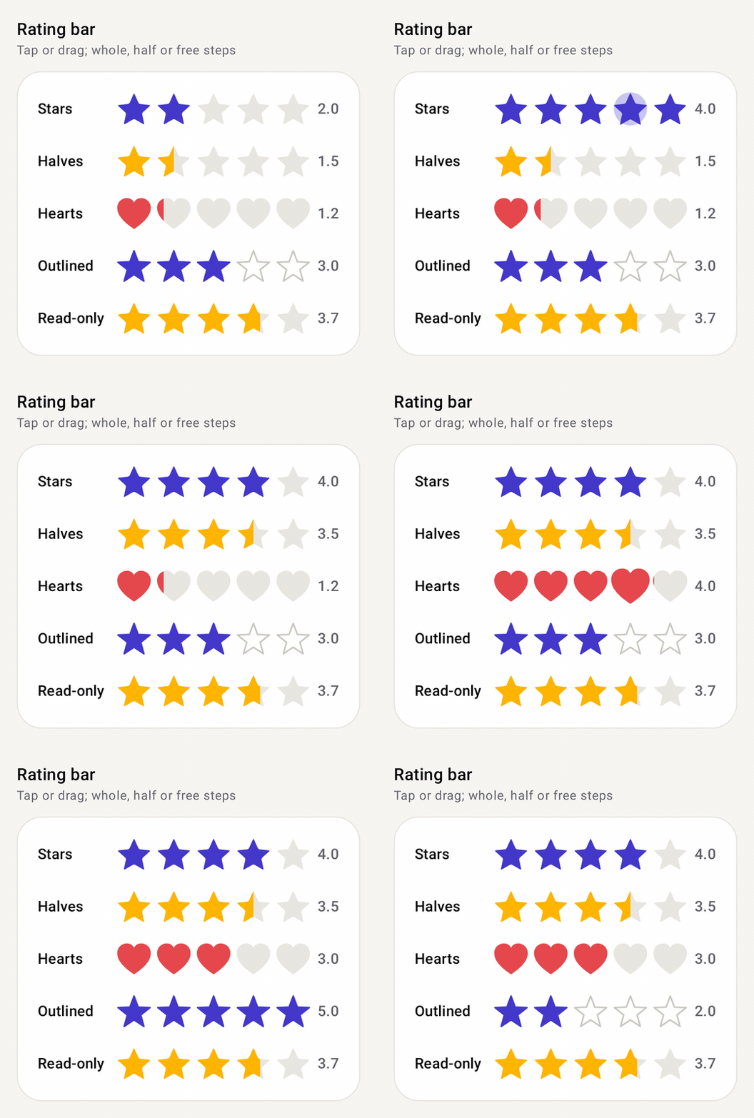
A row of stars, hearts, circles, or any Shape or Painter, for showing and picking a rating. Tap an item to rate, or drag across the bar and the rating follows your finger.
Preview
How it works
- Stateless. You pass
ratingand update it inonRatingChange, which runs while the user taps or drags.onRatingChangeFinishedruns when the finger lifts, which is the place to save. - Read-only is
onRatingChange = null. The bar then just shows the value, and fractional ratings such as3.7fdraw a partly filled item. stepSizerounds the input.1ffor whole items,0.5ffor halves,0ffor any value.minRatingstops the user going below a floor andallowCleardecides whether tapping the current rating resets it.- Any item. Use the built-in
StarShape,SharpStarShapeandHeartShape, build a star withstarShape(points, innerRadiusRatio, roundness), pass any ComposeShape, or aPainterthat gets tinted with the bar's colors. - Animation runs in the draw phase. Items fill one after another, the tapped one pops with a halo and the one under your finger lifts, without recomposing the bar. Tune it with
RatingBarAnimation(...)or turn it off with.None.
Setup
Add the library once (see Getting started), then import from com.nameisjayant.components.ratingbar:
import com.nameisjayant.components.ratingbar.*Quick start
var rating by rememberSaveable { mutableFloatStateOf(3f) }

ComposeRatingBar(
    rating = rating,
    onRatingChange = { rating = it },
    onRatingChangeFinished = { viewModel.save(rating) },   // when the finger lifts
)
Steps, read-only and limits
ComposeRatingBar(rating, { rating = it }, stepSize = 0.5f)     // halves (1f = whole, 0f = any value)

ComposeRatingBar(rating = 3.7f, onRatingChange = null)         // read-only; fractions draw partly filled

ComposeRatingBar(
    rating = rating,
    onRatingChange = { rating = it },
    maxRating = 10,
    minRating = 1f,                                            // at least one star
    allowClear = false,                                        // tapping the current rating won't reset it
)
Shapes and colors
// Gold stars
ComposeRatingBar(rating, { rating = it }, colors = ComposeRatingBarDefaults.accentColors(ComposeRatingBarDefaults.Gold))

// Hearts
ComposeRatingBar(rating, { rating = it }, shape = ComposeRatingBarDefaults.HeartShape,
    colors = ComposeRatingBarDefaults.accentColors(Color(0xFFE5484D)))

// Outline-only empty stars
ComposeRatingBar(rating, { rating = it }, shape = ComposeRatingBarDefaults.SharpStarShape,
    borderWidth = ComposeRatingBarDefaults.OutlineWidth, colors = ComposeRatingBarDefaults.outlinedColors())

// Any star, or any Compose shape
ComposeRatingBar(rating, { rating = it }, shape = ComposeRatingBarDefaults.starShape(points = 6, innerRadiusRatio = 0.5f, roundness = 0.3f))
ComposeRatingBar(rating, { rating = it }, shape = CircleShape, itemSize = 20.dp, itemSpacing = 4.dp)

// An icon, tinted with the bar's colors
ComposeRatingBar(rating, { rating = it }, painter = painterResource(R.drawable.ic_thumb_up))
Animation
When the rating grows, items fill one after another with a soft bounce, the tapped item pops and sends out a halo, and the item under your finger lifts while you drag.
ComposeRatingBar(
    rating, { rating = it },
    animation = RatingBarAnimation(staggerMillis = 80, popScale = 1.4f, showHalo = false), // or RatingBarAnimation.None
)
All parameters
| Parameter | Default | Description |
|---|---|---|
rating | Current rating, 0..maxRating | |
onRatingChange | New rating while tapping or dragging; null makes the bar read-only | |
maxRating | 5 | Number of items |
stepSize | 1f | 1f whole, 0.5f halves, 0f any value |
minRating | 0f | Lowest rating the user can pick |
enabled | true | Ignore input and use the disabled colors when false |
allowClear | true | Tapping the current rating resets it to minRating |
itemSize / itemSpacing | 32.dp / 6.dp | Item size and gap |
shape | StarShape | StarShape, SharpStarShape, HeartShape, starShape(points, innerRadiusRatio, roundness) or any Shape |
painter | null | Draw a tinted Painter instead of shape |
borderWidth | 0.dp | Stroke around each item; use OutlineWidth with outlinedColors() |
colors | ComposeRatingBarDefaults.colors() | activeColor, inactiveColor, activeBorderColor, inactiveBorderColor, disabledActiveColor, disabledInactiveColor, haloColor |
animation | RatingBarAnimation.Default | RatingBarAnimation(staggerMillis, waveScale, popScale, dragScale, showHalo) or .None |
hapticFeedbackEnabled | true | Tick as the rating changes under the finger |
onRatingChangeFinished | null | Called when a tap or drag ends |
TalkBack users can adjust the rating with the standard slider actions. Right-to-left layouts fill from the right. Animations run in the draw phase, so the bar doesn't recompose while it moves.
API
The public signatures, straight from the library sources:
@Composable
public fun ComposeRatingBar(
    rating: Float,
    onRatingChange: ((Float) -> Unit)?,
    modifier: Modifier = Modifier,
    maxRating: Int = 5,
    stepSize: Float = 1f,
    minRating: Float = 0f,
    enabled: Boolean = true,
    allowClear: Boolean = true,
    itemSize: Dp = ComposeRatingBarDefaults.ItemSize,
    itemSpacing: Dp = ComposeRatingBarDefaults.ItemSpacing,
    shape: Shape = ComposeRatingBarDefaults.StarShape,
    painter: Painter? = null,
    borderWidth: Dp = 0.dp,
    colors: ComposeRatingBarColors = ComposeRatingBarDefaults.colors(),
    animation: RatingBarAnimation = RatingBarAnimation.Default,
    hapticFeedbackEnabled: Boolean = true,
    onRatingChangeFinished: (() -> Unit)? = null,
)