 Built forJetpack Compose
6 components for Jetpack Compose
The components Material 3 doesn't ship.
A date picker, wheel picker, OTP input, rating bar, timeline and color picker, built to feel like they always belonged in Material 3. They read your MaterialTheme, animate, and work with screen readers.
implementation("io.github.nameisjayant:compose-components:0.1.0")- 6components
- M3themed
- 24min SDK
- v0.1.0Maven Central
Learn one, know them all
Every component is put together the same way, so the second one takes minutes.
Theme first
Colors, shapes and type come from MaterialTheme, so every component matches your app, dynamic color included.
One accent
accentColors(accent) repaints the highlights in your brand color. Every colors class also has copy(...).
Slots for custom drawing
dayContent, cellContent, itemContent and indicator hand you the full state of each item to draw it yourself.
Tuned motion
Animations you can tune with XxxAnimation(...) or switch off with XxxAnimation.None. Haptics where they help.
Accessible and RTL
Screen-reader semantics on every part, adjustable controls for pickers and sliders, and right-to-left layouts.
minSdk 24, no desugaring
The date picker uses its own CalendarDate type, so nothing needs java.time or core library desugaring.
Components
Each one has its own page with explanations, code you can copy and every parameter.
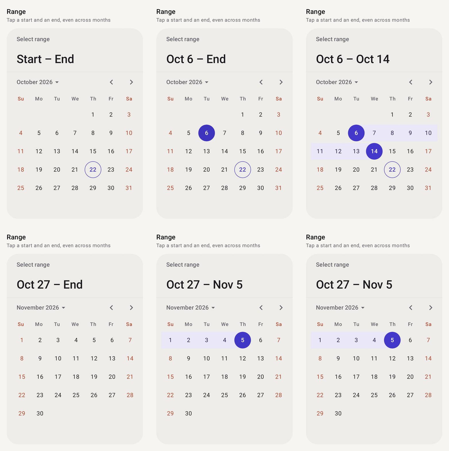
Date picker
ComposeDatePickerSingle date, range or many dates, with disabled days, decorations and a year grid.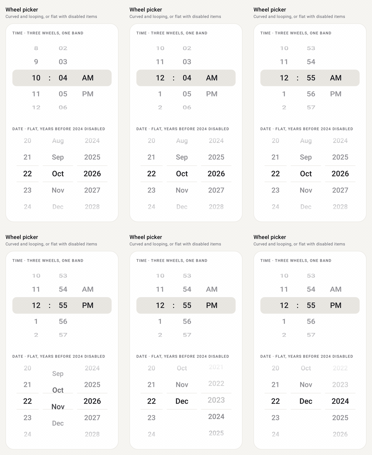
Wheel picker
ComposeWheelPickerA scrolling wheel that snaps to a row. Cyclic, flat or curved, with custom rows.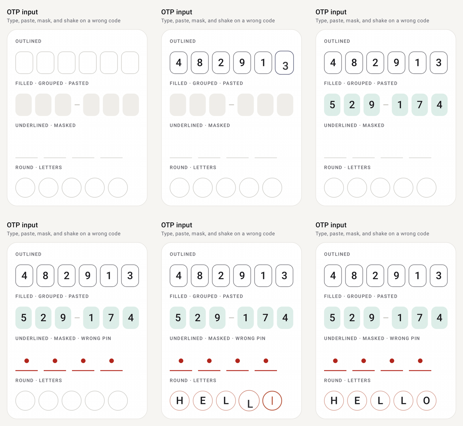
OTP input
ComposeOtpInputA one-time-code field split into cells, with paste, SMS autofill, masking and an error shake.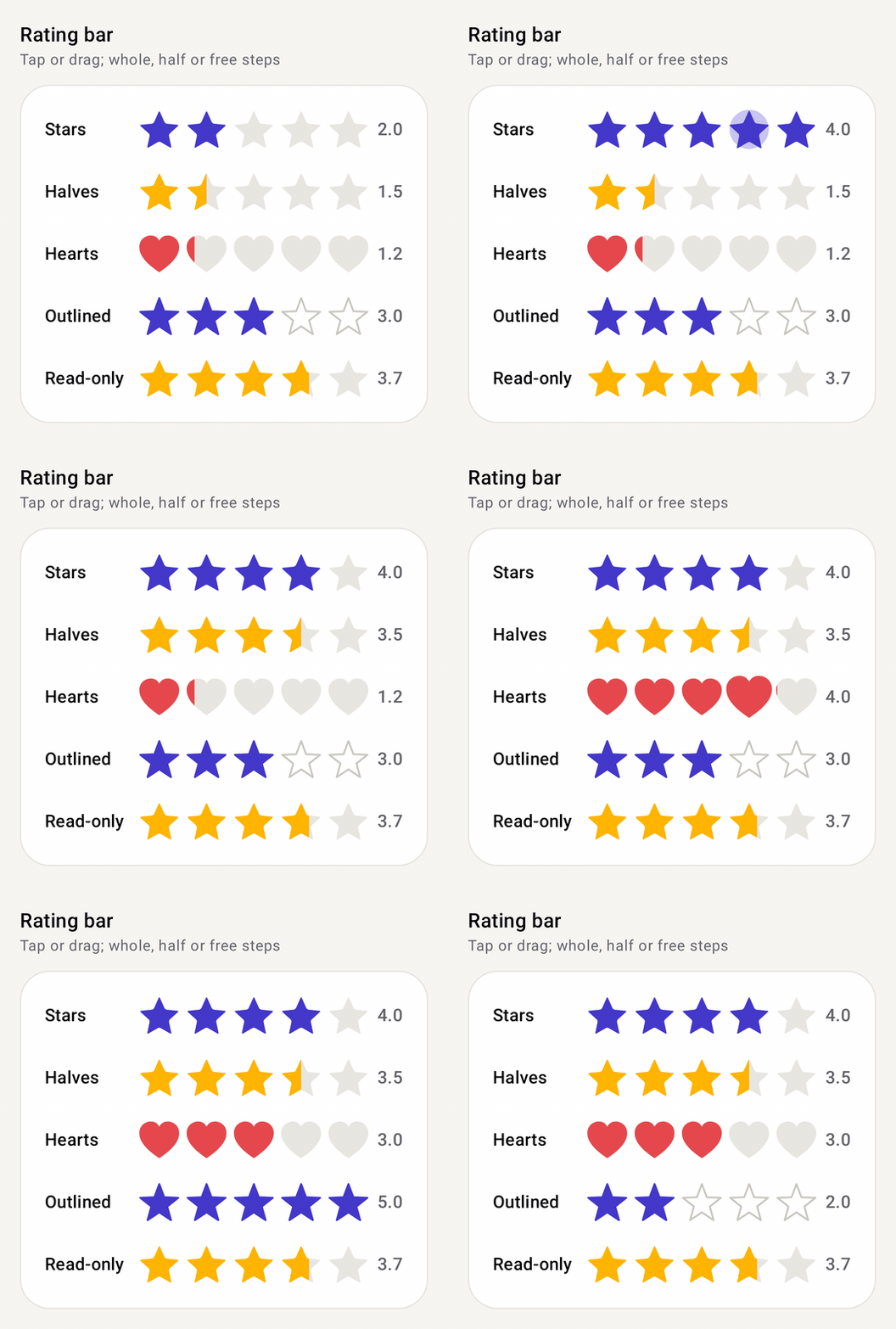
Rating bar
ComposeRatingBarStars, hearts or any shape. Tap or drag to rate, with halves, read-only mode and a fill cascade.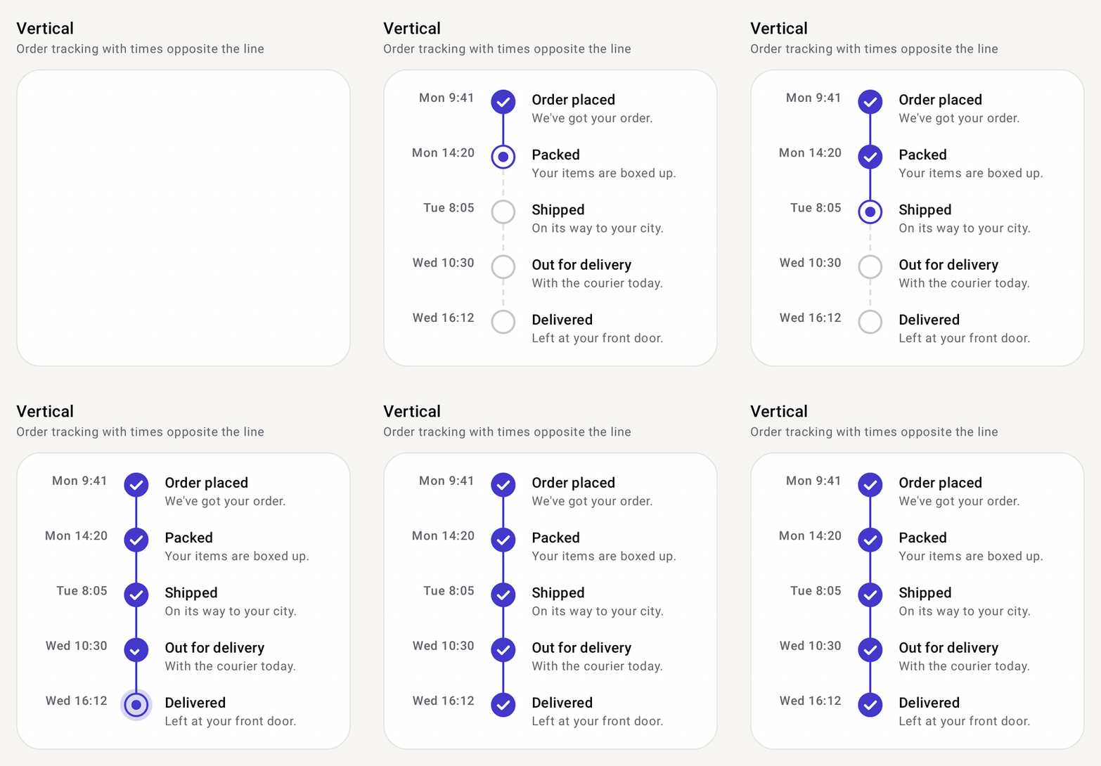
Timeline
ComposeTimelineSteps joined by a line, vertical or horizontal: order tracking, steppers, event history.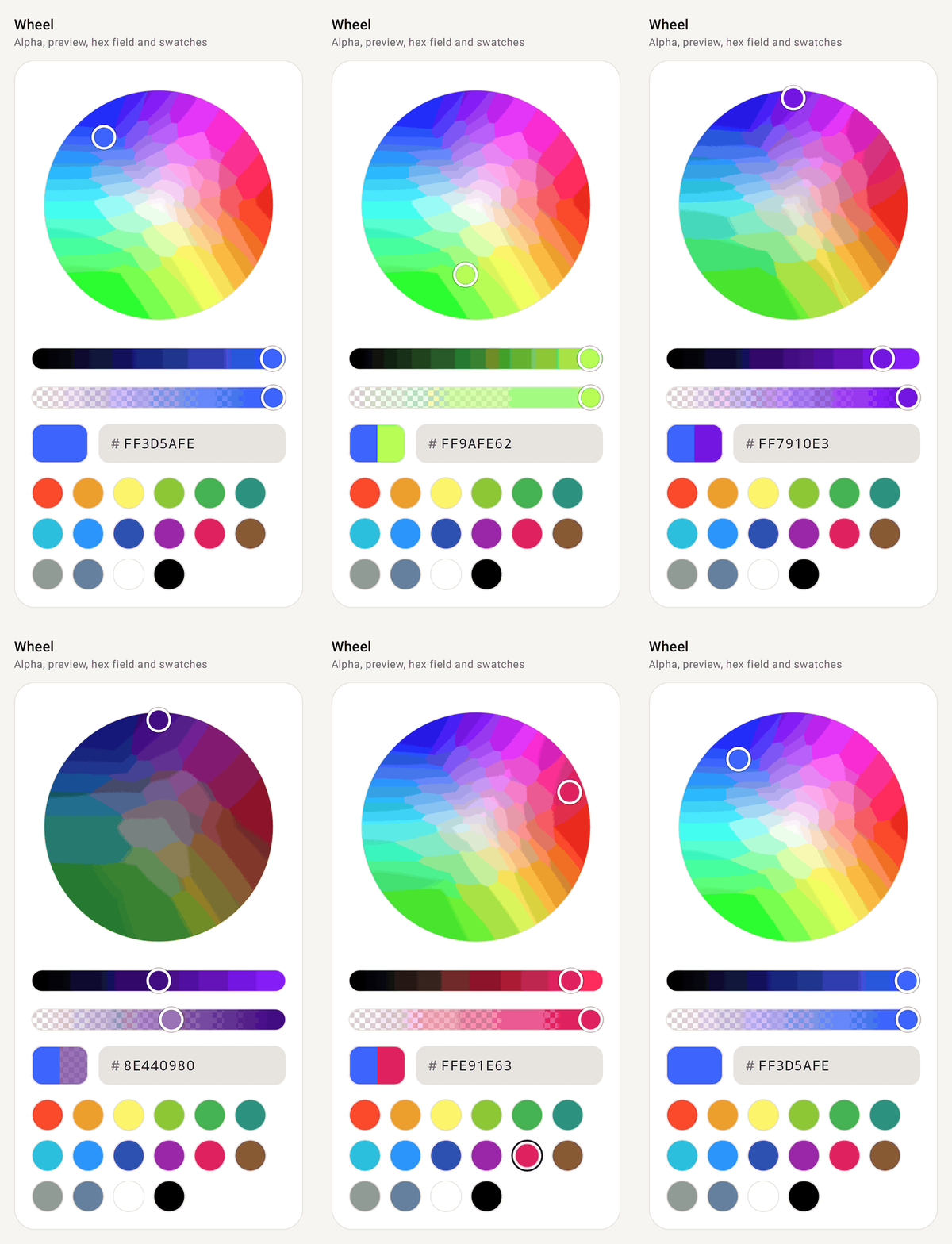
Color picker
ComposeColorPickerWheel, ring or square HSV picker with alpha, before/after preview, hex field and swatches.
Installation
Three steps from an empty project to your first component.
Add the dependency
The library is published to Maven Central. Make sure
mavenCentral()is in your repositories, then add:build.gradle.kts // build.gradle.kts dependencies { implementation("io.github.nameisjayant:compose-components:0.1.0") }Using a version catalog?
libs.versions.toml [versions] composeComponents = "0.1.0" [libraries] compose-components = { group = "io.github.nameisjayant", name = "compose-components", version.ref = "composeComponents" }Kotlin implementation(libs.compose.components)Check the requirements
Requirement minSdk24. Dates use the library's own CalendarDate, so you don't need core library desugaringCompose Material 3 is brought in through the Compose BOM as an apidependencyImports Everything lives under com.nameisjayant.components.<component>, e.g.com.nameisjayant.components.datepicker.*Drop in a component
Here's the rating bar. Every component is imported from
com.nameisjayant.components.<component>.ComposeRatingBar.kt var rating by rememberSaveable { mutableFloatStateOf(3f) } ComposeRatingBar( rating = rating, onRatingChange = { rating = it }, onRatingChangeFinished = { viewModel.save(rating) }, // when the finger lifts )