
Docs / Components / 01
ComposeDatePicker
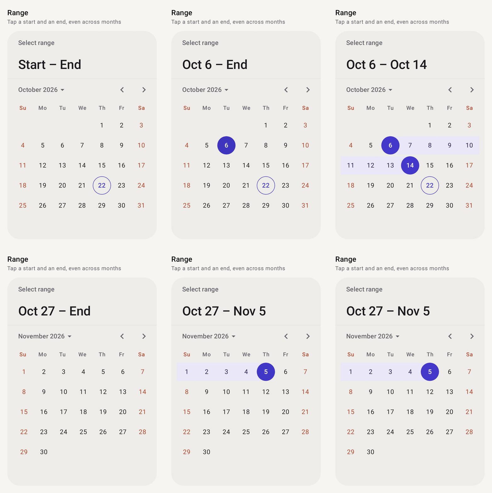
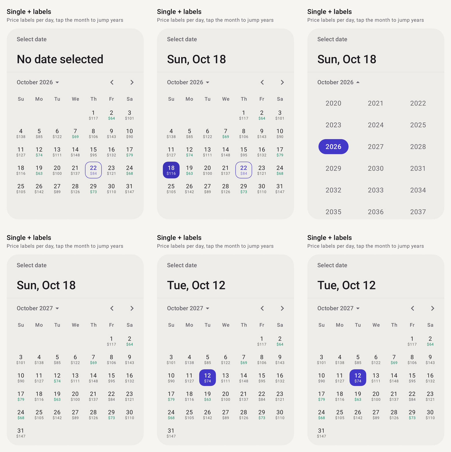
A month calendar for picking one date, a date range or several dates. Swipe or use the arrows to change month, and tap the month title to jump to another year.
Preview
How it works
- The state holds everything.
rememberComposeDatePickerState()keeps the selection mode, the selected date(s), the displayed month and the rules for which dates can be picked. The composable only draws it, so you read results from the state (selectedDate,selectedRange,selectedDates) and can drive it from code. - Three selection modes.
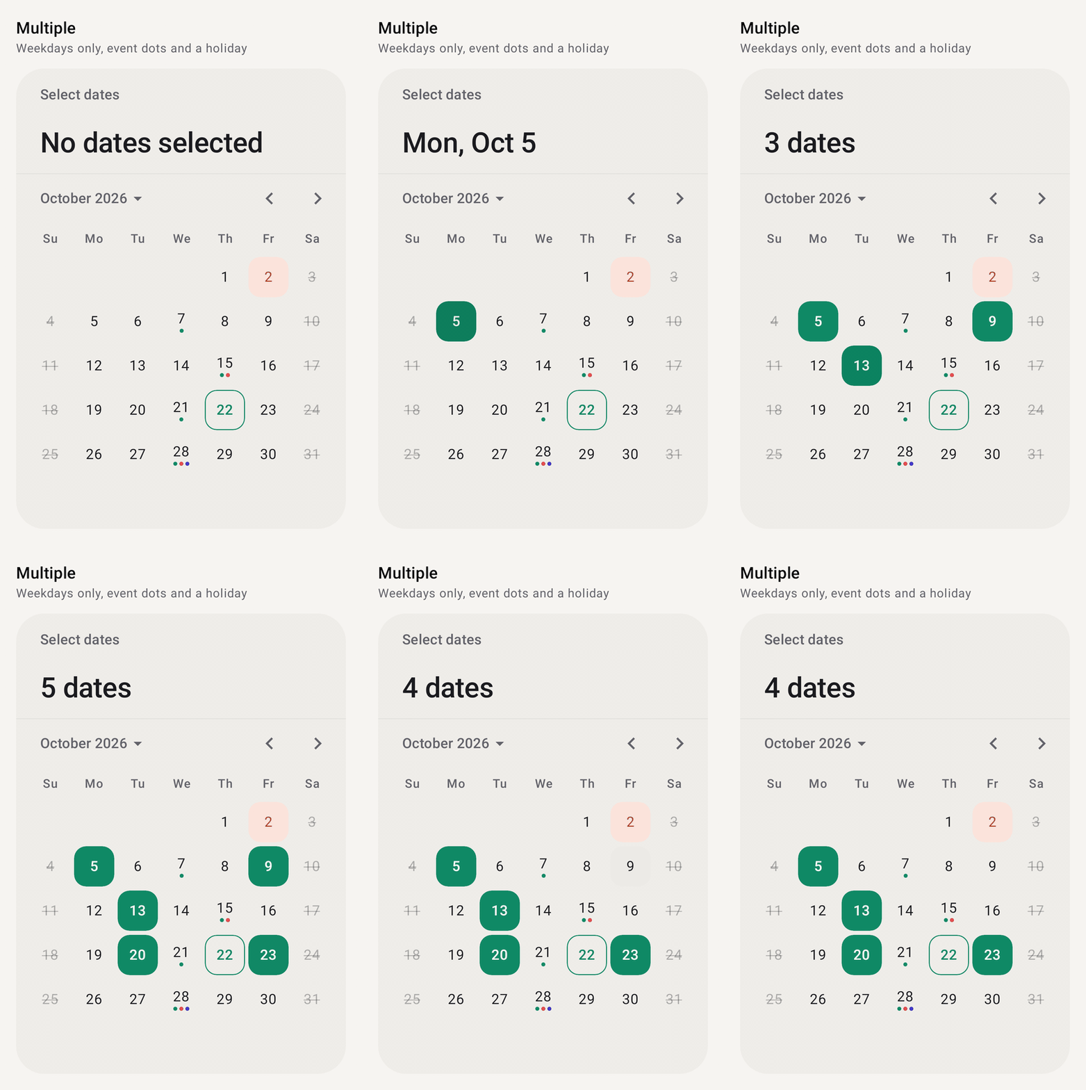
DateSelectionMode.Singlepicks one date,Rangepicks a start and an end (first tap, second tap), andMultipletoggles any number of dates, optionally capped withmaxSelectionCount. - Rules decide what can be tapped.
minDate/maxDateare hard bounds the calendar won't page past.SelectableDatesrules (weekdays only, except a list, your own lambda) disable individual days, and they combine withand/or. - Decorate or redraw days.
decorationadds dots, a small label or a tint to chosen days.dayContentreplaces what's drawn inside a day, while the picker still draws the selection, today's outline and the range band. - Its own date types.
CalendarDateandCalendarMonthreplacejava.time, so the picker runs on minSdk 24 without core library desugaring.
Setup
Add the library once (see Getting started), then import from com.nameisjayant.components.datepicker:
import com.nameisjayant.components.datepicker.*Quick start
val state = rememberComposeDatePickerState()          // Single by default

ComposeDatePicker(state = state)

state.selectedDate                                     // CalendarDate? e.g. 2026-10-22
Selection modes
// One date
val single = rememberComposeDatePickerState(
    selectionMode = DateSelectionMode.Single,
    initialSelectedDate = CalendarDate.today(),
)
single.selectedDate                    // CalendarDate?

// A start and an end. The first tap sets the start, the second the end.
val range = rememberComposeDatePickerState(selectionMode = DateSelectionMode.Range)
range.selectedRange                    // ClosedRange<CalendarDate>?, null until both ends are picked
range.rangeStart; range.rangeEnd       // each end on its own

// Any number of dates. Tapping a selected date removes it.
val multiple = rememberComposeDatePickerState(
    selectionMode = DateSelectionMode.Multiple,
    maxSelectionCount = 5,             // optional cap
)
multiple.selectedDates                 // Set<CalendarDate>
The state can also be driven from code: select(date), setRange(start, end), clearSelection(), isSelected(date), isSelectable(date), hasSelection, and displayedMonth (read it, or set it to jump to a month).
Disabling dates
val today = CalendarDate.today()
val state = rememberComposeDatePickerState(
    selectionMode = DateSelectionMode.Range,
    minDate = today,                                    // hard bounds: the picker won't page past them
    maxDate = today.plusMonths(6),
    selectableDates = SelectableDates.WeekdaysOnly and
        SelectableDates.except(publicHolidays),         // combine rules with `and` / `or`
    allowDisabledDatesInRange = false,                  // a range can't jump over disabled days
)

ComposeDatePicker(state, strikeThroughDisabledDays = true)| Built-in rule | Selects |
|---|---|
SelectableDates.All | every date (the default) |
SelectableDates.WeekdaysOnly / WeekendsOnly | Monday to Friday / Saturday and Sunday |
SelectableDates.notBefore(date) / notAfter(date) | on or after / on or before a date |
SelectableDates.except(dates) | everything except a collection of dates |
SelectableDates.exceptDaysOfWeek(WeekDay.Sunday, ...) | everything except some days of the week |
SelectableDates { date -> ... } | your own rule (it's a fun interface) |
state.selectableDates is mutable, so you can swap the rule at runtime, for example once booked dates have loaded.
Decorating days
Return a DayDecoration for the days that need one: up to three dots, a short label, a tinted background, or a different number color. Mix them however you like.
ComposeDatePicker(
    state = state,
    decoration = { date ->
        when {
            date in holidays -> DayDecoration(containerColor = Color(0xFFFBE4DC), contentColor = Color(0xFFB4472B))
            date in events -> DayDecoration(dots = listOf(Color.Unspecified, Color.Red)) // Unspecified = colors.decorationColor
            else -> prices[date]?.let { DayDecoration(label = "$$it", labelColor = Color(0xFF0F8A66)) }
        }
    },
)

DayDecoration.dot()                    // shorthand for a single dot
Drawing days yourself
dayContent replaces what's drawn inside each day. The picker still draws the selection background, today's outline and the range band, and LocalContentColor is set to the color the default text would use.
ComposeDatePicker(
    state = state,
    dayContent = { info: DayInfo ->
        Column(horizontalAlignment = Alignment.CenterHorizontally) {
            Text("${info.date.dayOfMonth}", fontWeight = if (info.isToday) FontWeight.Bold else null)
            info.decoration?.label?.let { Text(it, fontSize = 8.sp) }
        }
    },
)
DayInfo has date, isCurrentMonth, isEnabled, isSelected, isToday, isRangeStart, isRangeEnd, isInRange and decoration.
In a dialog
if (showPicker) {
    val state = rememberComposeDatePickerState(initialSelectedDate = booking.date)
    ComposeDatePickerDialog(
        onDismissRequest = { showPicker = false },
        confirmButton = {
            TextButton(onClick = { booking = booking.copy(date = state.selectedDate); showPicker = false }) { Text("OK") }
        },
        dismissButton = { TextButton(onClick = { showPicker = false }) { Text("Cancel") } },
    ) {
        ComposeDatePicker(state)
    }
}
Look and feel
ComposeDatePicker(
    state = state,
    colors = ComposeDatePickerDefaults.accentColors(Color(0xFF0F8A66)),  // or .colors(...) / .copy(...)
    shape = RoundedCornerShape(28.dp),
    dayShape = ComposeDatePickerDefaults.RoundedDayShape,               // CircleShape by default
    firstDayOfWeek = WeekDay.Monday,                                    // the locale's first day by default
    showAdjacentMonthDays = true,
    highlightWeekends = true,
    title = null,                                                       // hide the small label…
    headline = { Text("When are you flying?") },                        // …or replace the big summary
)
Working with dates
The picker uses its own small CalendarDate / CalendarMonth types instead of java.time, so it works on minSdk 24 without desugaring.
val date = CalendarDate(2026, 10, 22)           // or CalendarDate.today(), CalendarDate.parse("2026-10-22")
date.plusDays(7); date.minusMonths(1); date.daysUntil(other)
date.dayOfWeek; date.isWeekend; date.calendarMonth
date.format("yMMMd")                            // "Oct 22, 2026", ordered for the user's locale

date.toEpochMillisUtc()                         // ↔ CalendarDate.ofEpochMillisUtc(millis)
date.epochDay                                   // ↔ CalendarDate.ofEpochDay(days)
CalendarDate.from(calendar)                     // from java.util.Calendar

val month = CalendarMonth(2026, 10)             // or CalendarMonth.current()
month.firstDay; month.lastDay; month.lengthOfMonth; date in month
month.format("MMMMy")                           // "October 2026"
All parameters
ComposeDatePicker
| Parameter | Default | Description |
|---|---|---|
state | Selection, displayed month and rules, from rememberComposeDatePickerState | |
colors | ComposeDatePickerDefaults.colors() | Colors of every part of the picker |
shape | RectangleShape | Outline of the picker; also clips its background |
dayShape | CircleShape | Shape of the selection, today's outline and decoration backgrounds |
firstDayOfWeek | locale's | Leftmost column |
showAdjacentMonthDays | false | Show neighbouring months' days in empty cells (not tappable) |
highlightToday | true | Outline today's date |
highlightWeekends | false | Color Saturday and Sunday with weekendContentColor |
strikeThroughDisabledDays | false | Strike through disabled days as well as dimming them |
yearSelectionEnabled | true | Tapping the month title opens a year grid |
decoration | null | (CalendarDate) -> DayDecoration? |
title | "Select date" | Small label at the top; null hides it |
headline | selection summary | Large text under the title; null hides it (hiding both also hides the divider) |
dayContent | null | @Composable (DayInfo) -> Unit to draw each day yourself |
rememberComposeDatePickerState: selectionMode, initialSelectedDate, initialSelectedRange, initialSelectedDates, initialDisplayedMonth, minDate (1900-01-01), maxDate (2100-12-31), selectableDates, maxSelectionCount, allowDisabledDatesInRange.
ComposeDatePickerDialog: onDismissRequest, confirmButton, dismissButton, shape, containerColor (match it to the picker's containerColor), tonalElevation, properties, content.
ComposeDatePickerColors: containerColor, titleContentColor, headlineContentColor, navigationContentColor, weekdayContentColor, weekendContentColor, dayContentColor, disabledDayContentColor, adjacentMonthDayContentColor, todayContentColor, todayBorderColor, selectedDayContainerColor, selectedDayContentColor, rangeContainerColor, rangeContentColor, decorationColor, dividerColor, yearContentColor, currentYearContentColor, selectedYearContainerColor, selectedYearContentColor.
accentColors(accent, onAccent, containerColor) derives the selection, today, range and year colors from one accent.
API
The public signatures, straight from the library sources:
@Composable
public fun ComposeDatePicker(
    state: ComposeDatePickerState,
    modifier: Modifier = Modifier,
    colors: ComposeDatePickerColors = ComposeDatePickerDefaults.colors(),
    shape: Shape = RectangleShape,
    dayShape: Shape = ComposeDatePickerDefaults.DayShape,
    firstDayOfWeek: WeekDay = ComposeDatePickerDefaults.firstDayOfWeek(),
    showAdjacentMonthDays: Boolean = false,
    highlightToday: Boolean = true,
    highlightWeekends: Boolean = false,
    strikeThroughDisabledDays: Boolean = false,
    yearSelectionEnabled: Boolean = true,
    decoration: ((CalendarDate) -> DayDecoration?)? = null,
    title: (@Composable () -> Unit)? = { ComposeDatePickerDefaults.Title(state) },
    headline: (@Composable () -> Unit)? = { ComposeDatePickerDefaults.Headline(state) },
    dayContent: (@Composable (DayInfo) -> Unit)? = null,
)

@Composable
public fun rememberComposeDatePickerState(
    selectionMode: DateSelectionMode = DateSelectionMode.Single,
    initialSelectedDate: CalendarDate? = null,
    initialSelectedRange: ClosedRange<CalendarDate>? = null,
    initialSelectedDates: Set<CalendarDate> = emptySet(),
    initialDisplayedMonth: CalendarMonth? = null,
    minDate: CalendarDate = ComposeDatePickerDefaults.MinDate,
    maxDate: CalendarDate = ComposeDatePickerDefaults.MaxDate,
    selectableDates: SelectableDates = SelectableDates.All,
    maxSelectionCount: Int = Int.MAX_VALUE,
    allowDisabledDatesInRange: Boolean = false,
): ComposeDatePickerState

@Composable
public fun ComposeDatePickerDialog(
    onDismissRequest: () -> Unit,
    confirmButton: @Composable () -> Unit,
    modifier: Modifier = Modifier,
    dismissButton: (@Composable () -> Unit)? = null,
    shape: Shape = ComposeDatePickerDefaults.DialogShape,
    containerColor: Color = MaterialTheme.colorScheme.surfaceContainerHigh,
    tonalElevation: Dp = 6.dp,
    properties: DialogProperties = DialogProperties(usePlatformDefaultWidth = false),
    content: @Composable ColumnScope.() -> Unit,
)