Docs / Overview
Getting started
Compose Components adds the Jetpack Compose components Material 3 doesn't ship. Each one takes its colors, shapes and typography from MaterialTheme and follows the same patterns, so learn them here once, then pick a component from the sidebar.

A Jetpack Compose library on top of Material 3. Every component is a plain @Composable: no Views, no XML, nothing to initialise.
Installation
The library is published to Maven Central. Make sure mavenCentral() is in your repositories, then add:
// build.gradle.kts
dependencies {
    implementation("io.github.nameisjayant:compose-components:0.1.0")
}| Requirement | |
|---|---|
minSdk | 24. Dates use the library's own CalendarDate, so you don't need core library desugaring |
| Compose | Material 3 is brought in through the Compose BOM as an api dependency |
| Imports | Everything lives under com.nameisjayant.components.<component>, e.g. com.nameisjayant.components.datepicker.* |
Version catalog
If your project uses libs.versions.toml, add the library there instead:
[versions]
composeComponents = "0.1.0"

[libraries]
compose-components = { group = "io.github.nameisjayant", name = "compose-components", version.ref = "composeComponents" }implementation(libs.compose.components)Imports
Each component has its own package under com.nameisjayant.components. Import the ones you use:
import com.nameisjayant.components.datepicker.*
import com.nameisjayant.components.wheelpicker.*
import com.nameisjayant.components.otpinput.*
import com.nameisjayant.components.ratingbar.*
import com.nameisjayant.components.timeline.*
import com.nameisjayant.components.colorpicker.*
Theming
There's nothing to set up. The components read MaterialTheme.colorScheme, shapes and typography, so they match your theme, dynamic color and dark theme included. To change colors, every component has a XxxDefaults.colors(...) to override single colors, an accentColors(accent) to repaint the highlights in one color, and a copy(...) on the colors class.
MaterialTheme(colorScheme = yourColorScheme) {
    // Every component picks up primary, surface, outline… from here.
    ComposeRatingBar(rating = rating, onRatingChange = { rating = it })
}

// One brand color for the highlights
ComposeRatingBar(
    rating = rating,
    onRatingChange = { rating = it },
    colors = ComposeRatingBarDefaults.accentColors(Color(0xFF0F8A66)),
)

// Or start from the theme's colors and change just one
ComposeRatingBar(
    rating = rating,
    onRatingChange = { rating = it },
    colors = ComposeRatingBarDefaults.colors().copy(inactiveColor = Color.LightGray),
)
Shared conventions
Once you've learned one component, you know how the rest are put together:
| Pattern | What it looks like |
|---|---|
| Theme first | XxxDefaults.colors(...) reads MaterialTheme.colorScheme; override only the colors you care about |
| One accent | XxxDefaults.accentColors(accent) repaints the highlights in a single brand color |
| Tweak a copy | Every colors class has copy(...) |
| State or value | The date picker is state-driven; the wheel and color pickers come as both a rememberXxxState() overload and a plain value + callback overload; the OTP input and rating bar are plain value + callback |
| Custom drawing | A slot such as dayContent, cellContent, itemContent or indicator gets the item's full state |
| Motion | Animated components take an XxxAnimation(...) to tune them, or XxxAnimation.None to turn them off |
| Survives rotation | rememberXxxState() uses rememberSaveable, so state survives configuration changes and process death |
All components
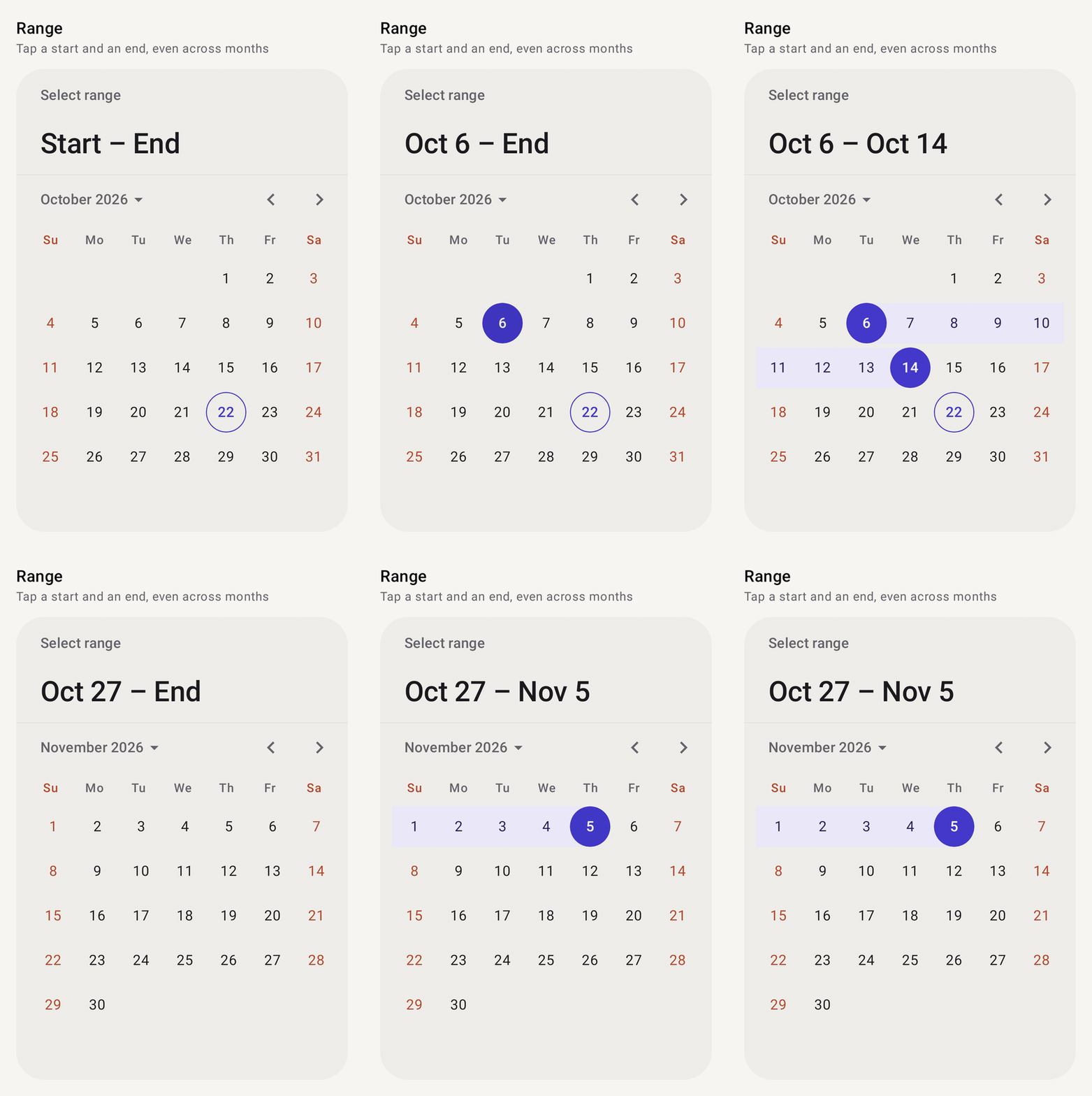
Date picker
ComposeDatePickerSingle date, range or many dates, with disabled days, decorations and a year grid.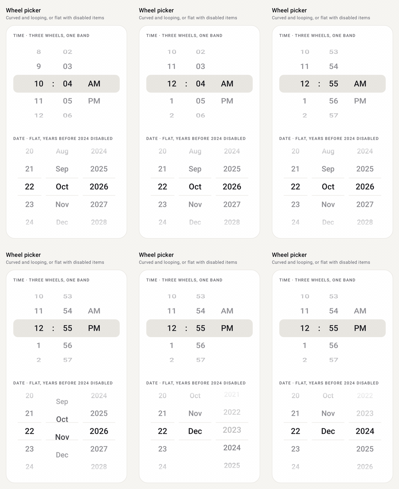
Wheel picker
ComposeWheelPickerA scrolling wheel that snaps to a row. Cyclic, flat or curved, with custom rows.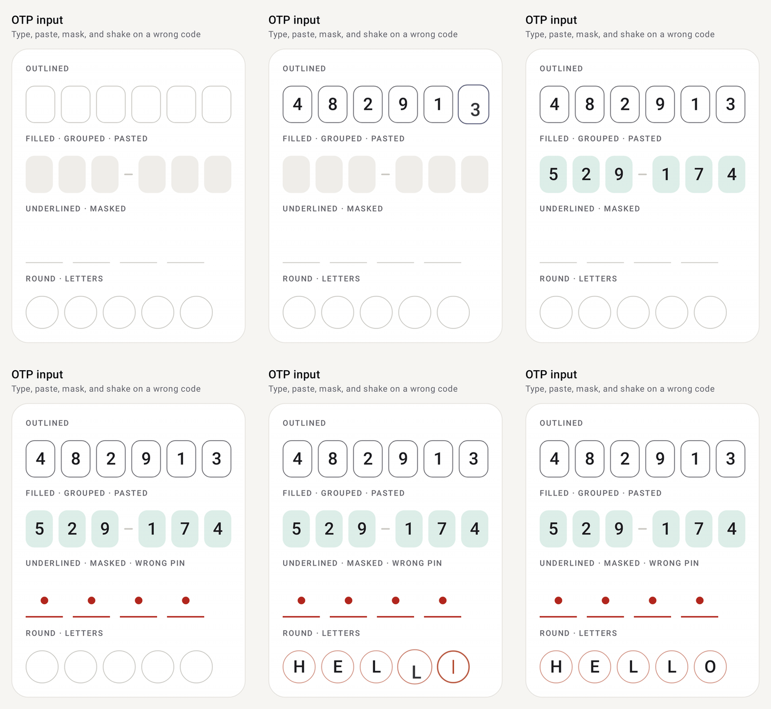
OTP input
ComposeOtpInputA one-time-code field split into cells, with paste, SMS autofill, masking and an error shake.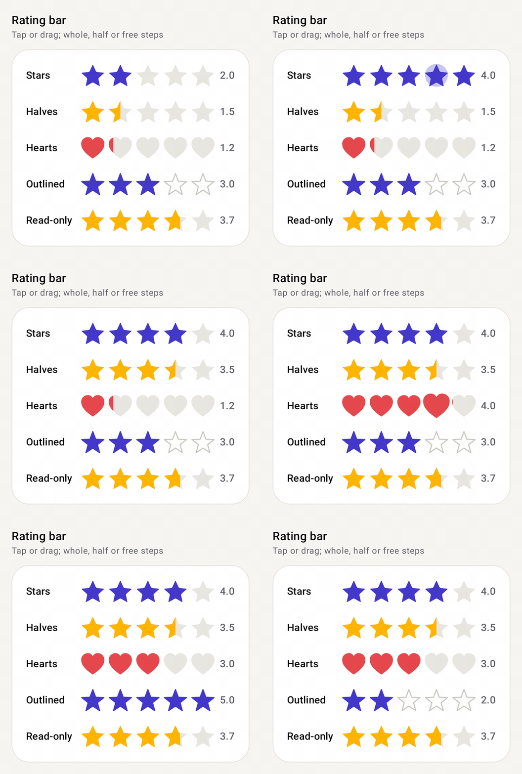
Rating bar
ComposeRatingBarStars, hearts or any shape. Tap or drag to rate, with halves, read-only mode and a fill cascade.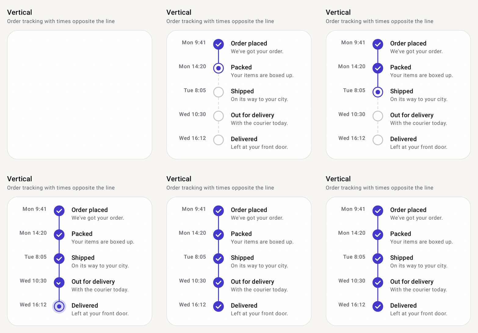
Timeline
ComposeTimelineSteps joined by a line, vertical or horizontal: order tracking, steppers, event history.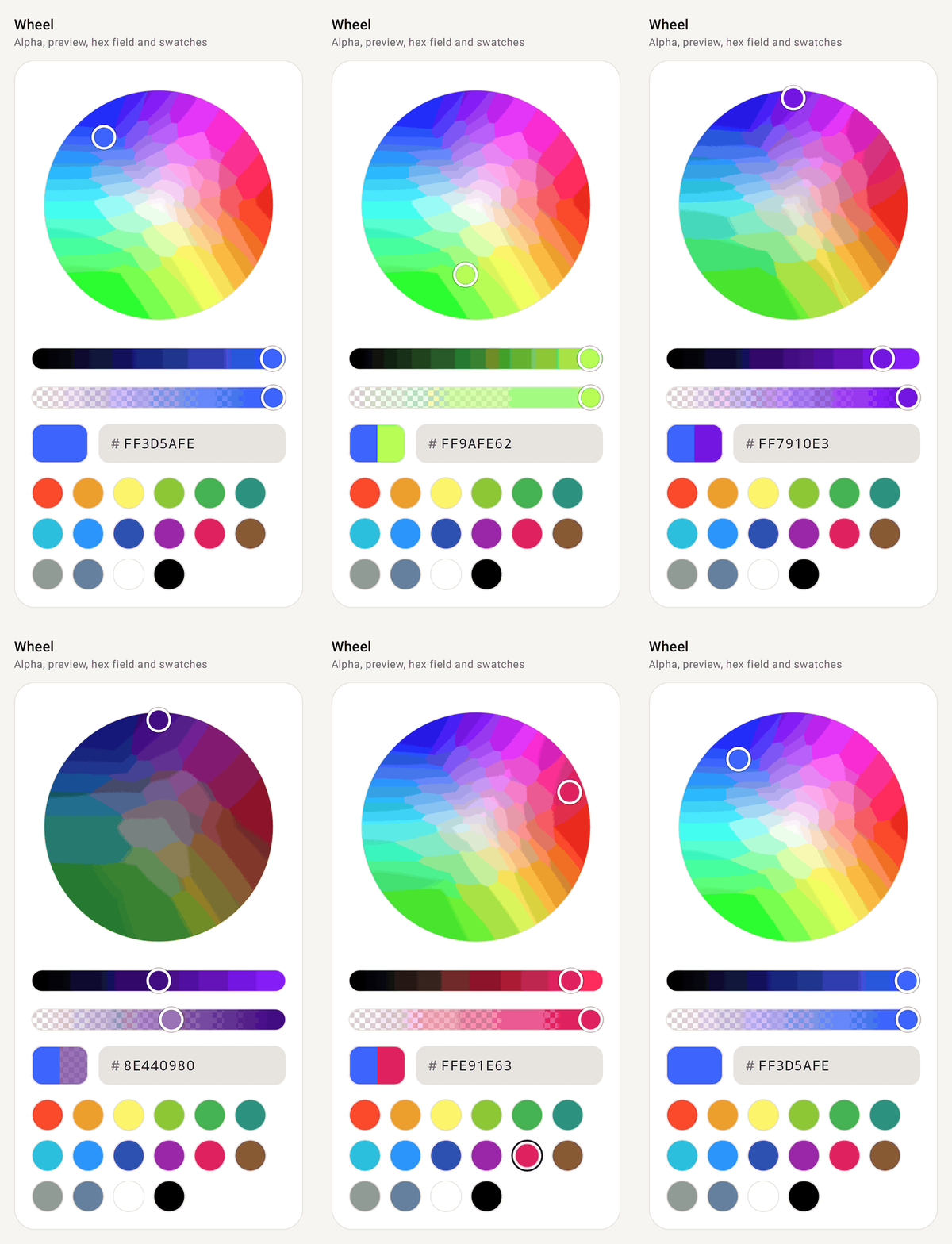
Color picker
ComposeColorPickerWheel, ring or square HSV picker with alpha, before/after preview, hex field and swatches.